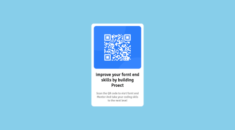
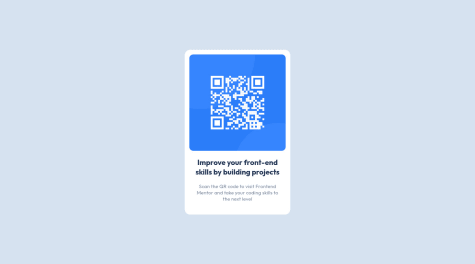
I would appreciate the communities feedback. Where could I've done better or what approach is better? Your feedback would go a long way. Thanks.
Amanda Buttineau
@ab1820All comments
- @chrisjay358Submitted almost 2 years ago@ab1820Posted almost 2 years ago
You honestly did a wonderful job!! Good job, and keep it up!! :)
0 - @nbuyldingSubmitted almost 2 years ago
- @ab1820Submitted almost 2 years ago@ab1820Posted almost 2 years ago
Unsure as to why the screenshot is not matching up, but the live site does match up.
0 - @VladoNo1Submitted almost 2 years ago@ab1820Posted almost 2 years ago
Hey there!
Your QR Code looks great with the fonts, colors, spacing, etc. The only thing I would recommend is tackling that large empty space at the bottom of the QR that extends to the bottom of the page. Check to see if your padding or margin for the bottom of your design is too much.
- also noticed that you repeat the html and body selector a couple times, try and refactor your code to clean it up a bit and it helps to make things easier to read.
I took a look at your code and noticed you added some 100vh. In a design like this, you don't really need to add any height as the margin and padding throughout the design around the font and title should expand the white background that you were looking for. Try removing the 100vh and see what happens!! :)
html,
body {
  min-height: 100vh;
}
body { height: 100vh; background-color: var(--light-gray); font-family: "Outfit", sans-serif; display: grid; justify-content: center; padding: 2rem; }Otherwise, great job and congrats! :)
Marked as helpful1 - @lagan-devSubmitted almost 2 years ago
All feedbacks are appreciated. Thank You.
@ab1820Posted almost 2 years agoHey there!! Here are some of my insights:
-
You should always try to remember to add a README page, a screenshot of your challenge would be a nice touch, also the read me allows you to explain how you went about doing the challenge and applying different styles, etc.
-
Just from looking at the preview, I can see that you did not apply any padding or margins which in turn makes your design look a little more squished than the challenge. Try playing around with those to see the outcomes! 3.Colors and font are spot on!! :)
Otherwise I dont see any real issues with your design just besides the padding and margin issues. NBD! Practice, and learn! :) You also managed to get the responsivness working which is awesome!
Happy Coding! :)
Marked as helpful1 -
- @nbuyldingSubmitted almost 2 years ago@ab1820Posted almost 2 years ago
Hey lady!!! :) I just wanted to point out the border-radius around your card! Otherwise it looks awesome and I think I may try this challenge next! :P
Marked as helpful0 - @Hyde17Submitted almost 2 years ago@ab1820Posted almost 2 years ago
Hey there! Not bad for your first attempt!! :)
One thing I noticed is your font style is different than the solutions, as well as the background color you used. Did you read over the style-guide that comes with the downloads? That will always tell you the type of font to use, font weight, colors, etc.
Marked as helpful0 - @omarshakibSubmitted about 2 years ago@ab1820Posted about 2 years ago
Hey!! Your design I noticed did not stick to the colors of the solution. (Not that that's a bad thing) As well as your font. I would personally suggest sticking to the design styles of the solution so you can visually see how close your solution turned out to the original. - Just my thoughts though!
Also be sure to triple check your spelling! I can see that you miss-spelled some words.
Responsiveness seems good, no issues there!
0 - @fachridpSubmitted about 2 years ago@ab1820Posted about 2 years ago
Hey! I gotta say, you solution is a very well done example! Your code looks good and clean as well :)
It seems to match up to the original solution nearly perfect.
0 - @anaflaviacsantosSubmitted about 2 years ago@ab1820Posted about 2 years ago
Hey, next time I would suggest using the colors given to you in the files for the challenge. The colors you chose make it hard to read the text unfortunately!
0


