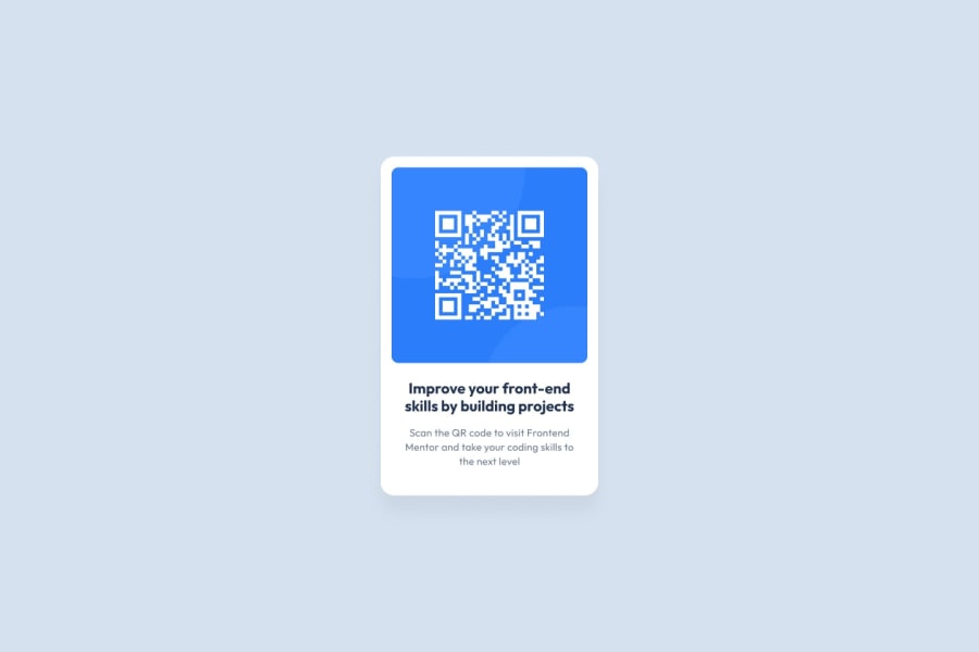
Design comparison
Community feedback
- @ab1820Posted almost 2 years ago
Hey there!
Your QR Code looks great with the fonts, colors, spacing, etc. The only thing I would recommend is tackling that large empty space at the bottom of the QR that extends to the bottom of the page. Check to see if your padding or margin for the bottom of your design is too much.
- also noticed that you repeat the html and body selector a couple times, try and refactor your code to clean it up a bit and it helps to make things easier to read.
I took a look at your code and noticed you added some 100vh. In a design like this, you don't really need to add any height as the margin and padding throughout the design around the font and title should expand the white background that you were looking for. Try removing the 100vh and see what happens!! :)
html,
body {
  min-height: 100vh;
}
body { height: 100vh; background-color: var(--light-gray); font-family: "Outfit", sans-serif; display: grid; justify-content: center; padding: 2rem; }Otherwise, great job and congrats! :)
Marked as helpful1
Please log in to post a comment
Log in with GitHubJoin our Discord community
Join thousands of Frontend Mentor community members taking the challenges, sharing resources, helping each other, and chatting about all things front-end!
Join our Discord
