I appreciate feedbacks. Please how can I make the banner appear closer to each bar?
Yaika Race
@YaikaRaceAll comments
- @Khemmie-RaySubmitted about 2 years ago@YaikaRacePosted about 2 years ago
Hello Khemmie, congratulations on completing this challenge! The solution to your problem is simple, you have to add
position: relative;to your.chart-containerand it will look like this:.chart-container { flex: 1; display: flex; flex-direction: column; align-items: stretch; justify-content: flex-end; position: relative; }This so that your
.bannertakes as reference of position to the container in which it is, after this you add atop: -48px;(this can be more or less distance depends on your taste) and it would be like this:banner { background-color: hsl(25, 47%, 15%); color: white; margin-bottom: .7em; padding: .4em .2em; border-radius: 5px; text-align: center; position: absolute; top: -48px; display: none; }And so all the banners will appear near their corresponding bar.
This was my solution to your problem, I hope I helped you!
happy coding!
0 - @JonathanthedeveloperSubmitted about 2 years ago
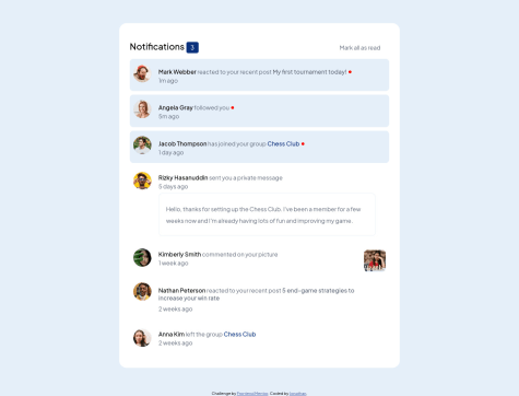
Hey guys i really had trouble making this responsive, Pls do well to check out my code and tell me how i could've done it better
@YaikaRacePosted about 2 years agoHi Jonathan congratulations on completing the notification page challenge! My recommendation to improve the responsiveness of the page is:
- Use less floats, floats give a lot of problems when making responsive designs, and personally I don't like to use them, instead I would recommend you to use flexbox to align elements to one side of the screen and make the design more responsive, you could even use CSS Grid to improve the responsiveness of the page.
- Here are some articles that may be useful if you don't know how to use flexbox and CSS Grid or you don't know much about it:
- https://css-tricks.com/snippets/css/a-guide-to-flexbox/
- https://developer.mozilla.org/en-US/docs/Web/CSS/CSS_Flexible_Box_Layout/Basic_Concepts_of_Flexbox
- https://css-tricks.com/snippets/css/complete-guide-grid/
1 - @vincemarq01Submitted about 2 years ago
in the comment section I use span and paragraph. I don't know if that is best structure for text combination
@YaikaRacePosted about 2 years agoHi vince congratulations on completing the notification page!
I see that you use Tailwind and that you set the colors using arbitrary values, I am not an expert, but, I recommend you to adjust your Tailwind configuration file to add the color palette that comes in the style guide and other custom properties you want to add to not repeat the color every time you want to use it, for example instead of putting
text-['hsl(224, 21%, 14%)']you could configure your tailwind.config.js file like this:
/** @type {import('tailwindcss').Config} */
module.exports = {
  content: ["./src/**/*.{html,js}"],
  theme: {
    colors: {
      'very-dark-blue': 'hsl(224, 21%, 14%)'
    }
    extend: {},
  },
  plugins: [],
}
so that the color is reusable and in your html file it would look like this:
<h1 class="text-very-dark-blue">Notifications</h1>and your code will be more readable for people who want to view and/or edit it! This is what I can recommend you, I hope it has been helpful!
Here are some links to documentation that might be useful for you: https://tailwindcss.com/docs/adding-custom-styles https://tailwindcss.com/docs/customizing-colors
Marked as helpful0


