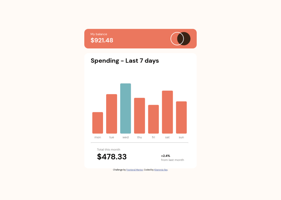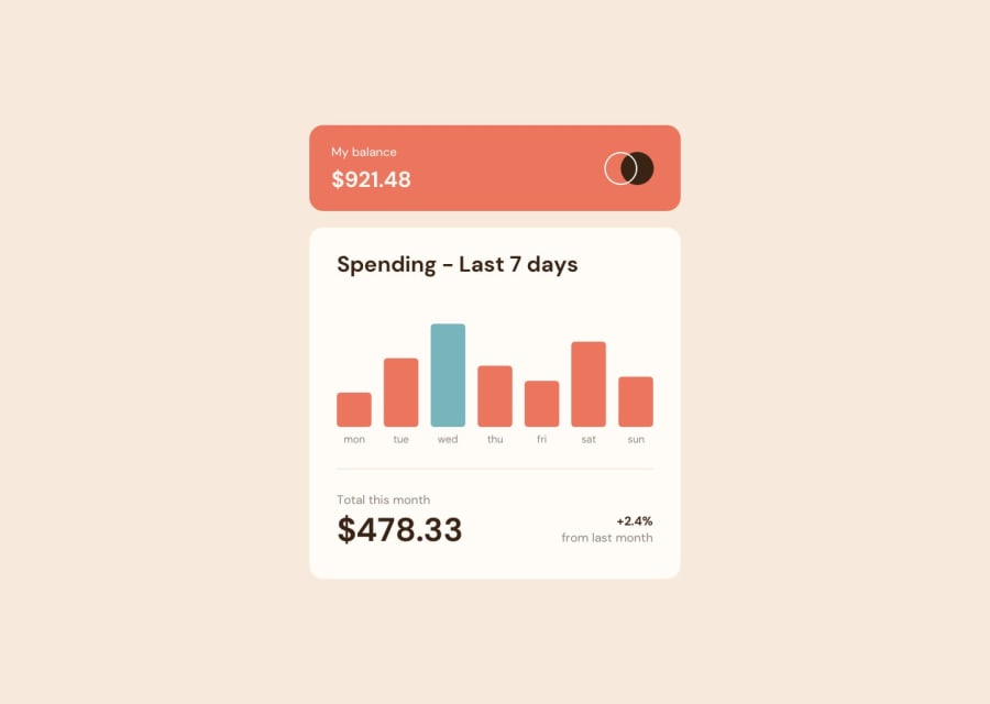
Design comparison
Solution retrospective
I appreciate feedbacks. Please how can I make the banner appear closer to each bar?
Community feedback
- @Khemmie-RayPosted over 2 years ago
Hello Yaika, I tried your suggestion but it took the banner farther away from the bars. Thanks for the suggestion.
0 - @YaikaRacePosted over 2 years ago
Hello Khemmie, congratulations on completing this challenge! The solution to your problem is simple, you have to add
position: relative;to your.chart-containerand it will look like this:.chart-container { flex: 1; display: flex; flex-direction: column; align-items: stretch; justify-content: flex-end; position: relative; }This so that your
.bannertakes as reference of position to the container in which it is, after this you add atop: -48px;(this can be more or less distance depends on your taste) and it would be like this:banner { background-color: hsl(25, 47%, 15%); color: white; margin-bottom: .7em; padding: .4em .2em; border-radius: 5px; text-align: center; position: absolute; top: -48px; display: none; }And so all the banners will appear near their corresponding bar.
This was my solution to your problem, I hope I helped you!
happy coding!
0
Please log in to post a comment
Log in with GitHubJoin our Discord community
Join thousands of Frontend Mentor community members taking the challenges, sharing resources, helping each other, and chatting about all things front-end!
Join our Discord
