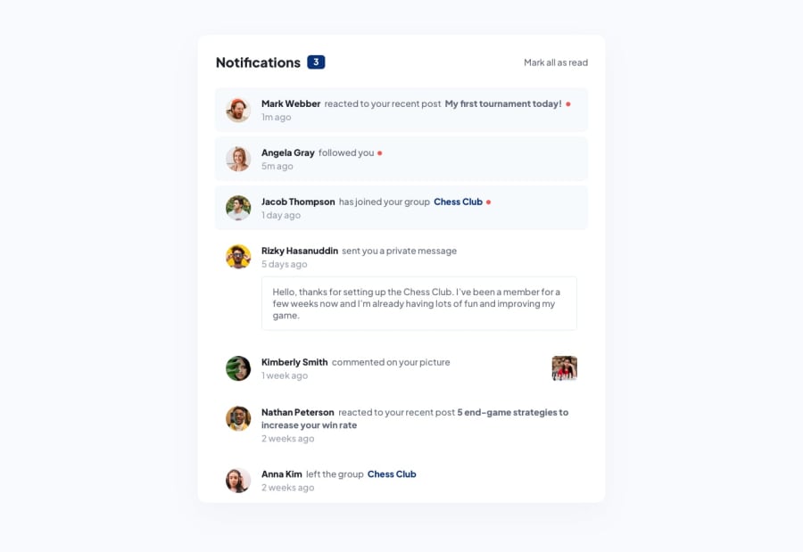
Design comparison
Solution retrospective
in the comment section I use span and paragraph. I don't know if that is best structure for text combination
Community feedback
- @YaikaRacePosted about 2 years ago
Hi vince congratulations on completing the notification page!
I see that you use Tailwind and that you set the colors using arbitrary values, I am not an expert, but, I recommend you to adjust your Tailwind configuration file to add the color palette that comes in the style guide and other custom properties you want to add to not repeat the color every time you want to use it, for example instead of putting
text-['hsl(224, 21%, 14%)']you could configure your tailwind.config.js file like this:
/** @type {import('tailwindcss').Config} */
module.exports = {
  content: ["./src/**/*.{html,js}"],
  theme: {
    colors: {
      'very-dark-blue': 'hsl(224, 21%, 14%)'
    }
    extend: {},
  },
  plugins: [],
}
so that the color is reusable and in your html file it would look like this:
<h1 class="text-very-dark-blue">Notifications</h1>and your code will be more readable for people who want to view and/or edit it! This is what I can recommend you, I hope it has been helpful!
Here are some links to documentation that might be useful for you: https://tailwindcss.com/docs/adding-custom-styles https://tailwindcss.com/docs/customizing-colors
Marked as helpful0@vincemarq01Posted about 2 years ago@YaikaRace ohh this is what I'm looking for. thank you very much yaika
0
Please log in to post a comment
Log in with GitHubJoin our Discord community
Join thousands of Frontend Mentor community members taking the challenges, sharing resources, helping each other, and chatting about all things front-end!
Join our Discord
