
Tushar Kaundal
@TusharKaundalAll solutions
Responsive Multi Level Form
#accessibility#react#react-hook-form#react-router#tailwind-cssSubmitted about 1 month ago- State Management around routing in a better way
Responsive Testimonials grid section using CSS Grid and SCSS
#accessibility#sass/scssSubmitted 6 months agoNeed high five / hands up for helping it making more responsive for different viewports and how CSS grid can be used for efficiently
Responsive Product Preview Card Component using flexbox
#accessibilitySubmitted 6 months agoHow to make this cards more responsive on different viewpoint , basically width of different div and how grid can be used here
Responsive Product Card Component using CSS
#accessibilitySubmitted 6 months agoNeed help regarding how to responsively design these kind of design in a better way , and how can i use scrset , sizes and picture tag for better responsive design
Responsive Recipe Main Page using CSS Flexbox
#accessibilitySubmitted 6 months agohow to make this design more responsive like section,typography changes with different viewport
Responsive Social link profile using HTML and CSS
#accessibilitySubmitted 7 months agoHow to place footer at bottom of the page
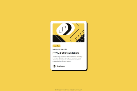
Blog Preview card Responsive page using CSS Flexbox
Submitted 7 months ago- How better we can design above Blog Preview Card webpage
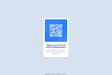
QR_Code card designing using CSS and HTML
Submitted 7 months ago- Help in better solution for designing part of website