Responsive Recipe Main Page using CSS Flexbox
Design comparison
Solution retrospective
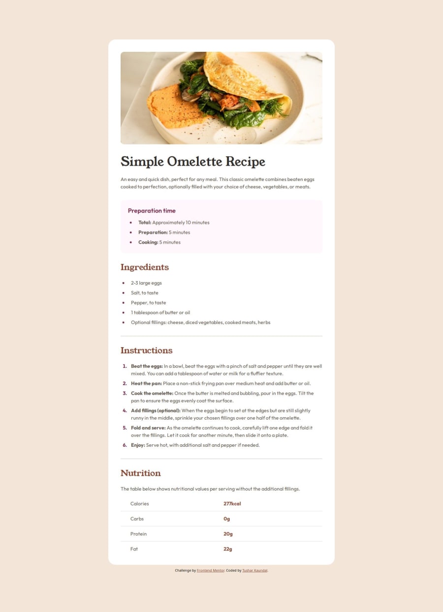
Was able to style and provide good design to nutrition table section after learing from different resources and applying it here to get better result just by using CSS property
What challenges did you encounter, and how did you overcome them?While going through development for this page came across nutrition article where table is to be formed so learned CSS property nth-child() and nth-last-child().Which helped me target/select the column/rows and did styling so looks good.
Below are the code snippets used to provide style to nutrition article :
    Calories
    277kcal


    Carbs
    0g


    Protein
    20g


    Fat
    22g
.nutrition-table {
  padding: 0px 32px;
  border-collapse: collapse;
}

tr:nth-child(-n + 3) td {
  border-bottom: 2px solid var(--stone-150);
  padding-bottom: 12px;
}

tr:nth-last-child(-n + 3) td {
  padding-top: 12px;
}

tr td:nth-child(1) {
  padding-left: 32px;
}

### What specific areas of your project would you like help with?
how to make this design more responsive like section,typography changes with different viewport
Community feedback
- @telsabate-hubPosted 6 months ago
You're doing really great!!! Just a small suggestion, you could directly put the texts inside the
litags instead of wrapping them inside aptag. Also, you could use theborder-bottomproperties to show the horizontal dividers instead of using thehrtags.By the way, I like how your design looks on screen sizes such as on iPad compared to what I did. So, I will try to apply what you did here.
Thank you so much and happy coding!! :)
Marked as helpful0
Please log in to post a comment
Log in with GitHubJoin our Discord community
Join thousands of Frontend Mentor community members taking the challenges, sharing resources, helping each other, and chatting about all things front-end!
Join our Discord
