Not Found
Not Found
Not Found
Not Found
Not Found
Not Found
Not Found
Not Found
Not Found
Not Found
Not Found
Not Found
Not Found
Not Found
Not Found
Not Found
Not Found
Not Found
Not Found
Not Found

All comments

  • @MuyiwaSaka

    Submitted

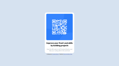
    I'm new to working with the assets given as part of the design brief. I had to launch the png files and then try to get my measurements from there. I also ended up relying on em and vh figures for successfully configuring my design to be responsive.

    I used percentages a lot to ensure the design was responsive. What is the best practice with respect to using percentages.
    @Tumelo4

    Posted

    It will be match easier if you used flex box or grid to center your container. for flex box body { display: flex; justify-content: center; align-item:center; } whatever element inside body will be on center of the body. Also try to separate styling and marks

    Marked as helpful

    1