Thibaut
@ThibautMilvilleAll comments
- @MahmoudAlSayed0Submitted over 1 year ago@ThibautMilvillePosted over 1 year ago
Hey,
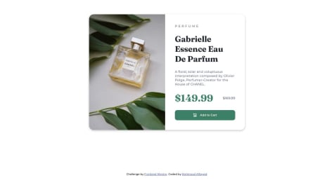
Don't forget the background-color, so it will look closer to the challenge. The crossed-out price should be closer to the price as well.
Have fun, enjoy!
Marked as helpful0 - @JOJOK63Submitted over 1 year ago
Hi all!
Tell me where i can improve my code
Thank you !
@ThibautMilvillePosted over 1 year agoHey,
Change the height of your "content" div to '100%', so your button will be included in your section (and you can change the 'div' block to a 'section' block, it's more semantically correct).
Have fun!
Marked as helpful0 - @williamc712Submitted over 1 year ago
i dont really know how to utilize the 2 product images so i just put display none in the mobile breakpoint, is that okay? or is there a better way to implement the desktop and mobile product image?
@ThibautMilvillePosted over 1 year agoHey,
Feel free to add a space between the icon and the button text. It'll look much nicer.
Have fun!
1 - @EsphalonSubmitted over 1 year ago
As a first step into javascript and the DOM, this was a tough challenge this week. I will try to do something more basic next week and write cleaner code.
Feel free to look in my code and give me feedback how to handle this better, I am happy with the end result though.
Thank you!
@ThibautMilvillePosted over 1 year agoHey,
Don't hesitate to use a class, it will be more professional and will make your code more correct.
You can also try using date functions with getDate, getMonth, getFullYear etc...
Have fun!
0 - @AhmadmustSubmitted over 1 year ago@ThibautMilvillePosted over 1 year ago
Hey,
Be careful with your social icons: when you hover over them, the icon is not visible unless you directly hover over the icon itself. You should make it visible (white) when the entire area is hovered over.
Also, don't hesitate to change the color when you hover the newsletter registration button.
0 - @AaronNevalinzSubmitted over 1 year ago
- difficulty in centering the container harboring the QR-code image and the description
How do you best center a div in a div?
@ThibautMilvillePosted over 1 year agoHello,
In this case, you should simply give your body a 100% height adapted to the user's screen (100vh), using flex and the align-items / justify-content properties so that your container is perfectly aligned in the center of the page.
body{ height: 100vh ; display : flex ; justify-content : center ; align-items : center ; }
Good luck and happy coding!
1


