

Design comparison

Solution retrospective
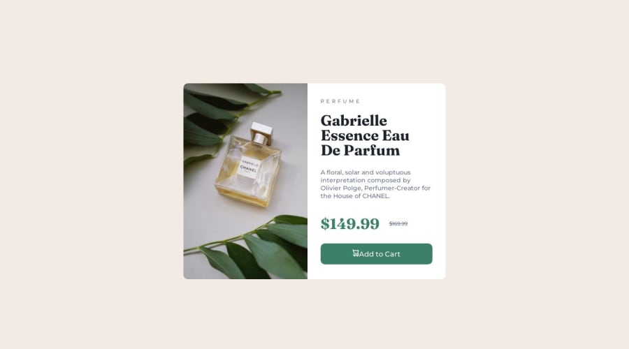
i dont really know how to utilize the 2 product images so i just put display none in the mobile breakpoint, is that okay? or is there a better way to implement the desktop and mobile product image?
Community feedback
- @adityaphasuPosted over 1 year ago
Hi!
To use or display images based on breakpoints you can use <picture> element.
Here's some explanation of the element:
<picture> <source srcset="image-large.jpg" media="(min-width: 1200px)"> <source srcset="image-medium.jpg" media="(min-width: 900px)"> <img src="image-small.jpg" alt=""> </picture>- Here in the above code snippet inside the
<picture>element im using 2<source>elements . - Each of these
<source>element specifies a different image using thesrcsetattribute. (basically setting the img URLs to use for breakpoints) - The
mediaattribute is used to set the conditions for when these<source>should be used i.emin-width:900pxandmin-width:1200px.These are like same media queries you use in css but its an attribute here. just like in css if you want to change the bg-color to red when the the screen is above 768x using media query, here it changes the images - In the example initially, if the device is on a small-screen, the
<img>tag will be used, showing the small image. - As the device width increases and reaches 900px mark , the "image-medium.jpg" will be displayed.
- Further increasing the width and hitting the 1200px mark will switch to showing "image-large.jpg".
Here's how you can implement it in your project:
- In your
.card-imgdiv add:
<picture>
<source srcset="images/image-product-desktop.jpg" media="(min-width: 780px)" >
<img src="images/image-product-mobile.jpg" alt="Perfume Image" >
</picture>
and after adding this you can remove the other 2 images and that's it!
Using <picture> is great if you want the images to switch based on screen sizes so its great for responsiveness!
Good luck and Happy coding!🕺🏻
Marked as helpful1@williamc712Posted over 1 year ago@adityaphasu amazing explanation thank you very much for the effort explaining it to me, I'm surely going to try using the picture element soon!
1 - Here in the above code snippet inside the
- @PiotrPlotastPosted over 1 year ago
When you need to change image depending on the size of the screen you should use
picturehtml element. Here is helpful article on mdn: The picture element2@williamc712Posted over 1 year ago@Pietrelll Thank you for the guide! I will try using picture element soon! Thanks for the link about picture element documentations, it helps a lot!
0 - @ThibautMilvillePosted over 1 year ago
Hey,
Feel free to add a space between the icon and the button text. It'll look much nicer.
Have fun!
1@williamc712Posted over 1 year ago@ThibautMilville I completely forgot about this, Thank you for reminding me!
0


Please log in to post a comment
Log in with GitHub
Join our Discord community
Join thousands of Frontend Mentor community members taking the challenges, sharing resources, helping each other, and chatting about all things front-end!
Join our Discord