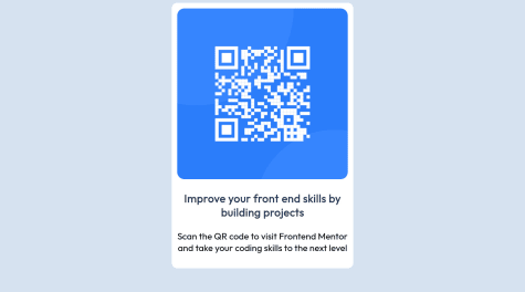
i would appreciate if you could find any way to improve my css or html code.
Mihailo Dilparic
@TheDilpAll comments
- @ADCByDefaultSubmitted over 2 years ago@TheDilpPosted over 2 years ago
This is pretty great! Nice work.
For HTML you can see that you have some accessibility issues, I would recommend adding a <main> tag that wraps the card. Otherwise it looks good to me.
As far as CSS goes I think that giving the card some box-shadow would improve it and bring it closer to the final design.
Marked as helpful1 - @bellaalvesSubmitted over 2 years ago
Hello guys! Well, here I am with another solution. Any tips would be very helpful since I did struggle a little bit with this challenge. I uused a lot of grid and a little bit of flexbox. Still not very happy with my solution, but let's keep coding so I can improve.
@TheDilpPosted over 2 years agoThis looks really good! It's really close to the design. Responsiveness also looks great.
As far as improvements I think adjusting the line height (and potentially font weight) of the card text would go a long way, as well as the text underneath the main title. And maybe some top margin between the user images/names and their testimonials.
0 - @CallMe-ALSubmitted over 2 years ago
Other features included in this project include color theme toggling, localstorage to save preferences and filters, search term highlighting, and lazy loading.
Could there be a nicer way to display border countries for specific countries? I feel it makes the individual country page look too uneven when border countries exceed 3. Also, I've tried using more modern CSS properties like clamp() to make pages display more responsively. How'd I do?
Any other feedback is appreciated! Thank you!
@TheDilpPosted over 2 years agoThis is really good, lazy loading is a really nice touch.
For the border countries, you could put the "Border Countries:" heading into one column and the tags into another, so that the tags are always contained in a separate area and don't go underneath the heading. You can then adjust the width of that second area to your liking and use flexbox and wrap to make them look nice.
Marked as helpful1 - @BismeetSinghSubmitted over 2 years ago
Is the styling fitting the requirement ? I am a bit unsure.
@TheDilpPosted over 2 years agoGreat work on this, I think it looks quite nice.
Some things I think would help:
- The text could use more padding, so that there is a bigger border between it and the edge of the card
- The top text should have a bigger font weight
- The bottom text's color should be lighter, maybe like a light grey
Keep up the good work!
Marked as helpful0 - @KarolisGaivSubmitted over 2 years ago
Question:
- My dice button functionality does not work completely properly. While it renders a new advice, this happens only after a few clicks. I'm not sure why it does not work on every single click
Any help would be greatly appreciated!
@TheDilpPosted over 2 years agoFor the dice not fetching on each click, if you're using the fetch API set the cache to "no-store" or "no-cache", example on MDN Docs.
You can see the issue in the network tab of the DevTools of your browser, it is fetching on each click, but from the cache, meaning it gets the same advice. If you wait a second or two between each click then it will fetch new ones with the current settings.
Otherwise, great work! That's pretty close to the design 👍
Marked as helpful1


