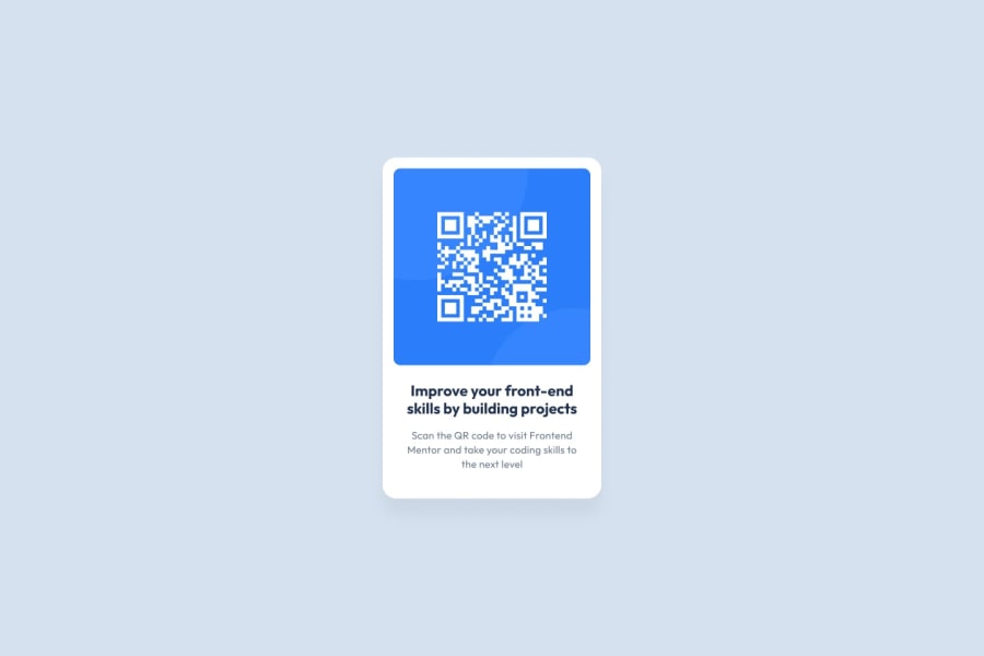
Design comparison
Solution retrospective
i would appreciate if you could find any way to improve my css or html code.
Community feedback
- @superschoolerPosted over 2 years ago
Gread job on this project, it looks fantastic! I love your use of variables in CSS and using rem instead of px for the most part. However, <p> uses px while <h1> uses rem, so if the user has a different default font-size they won't scale the same.
A couple pieces of constructive criticism are below. They're very nit-picky since you did a very good job, but something to perhaps keep in mind on the next one!
Additionally, alternate text (alt) is supposed to be a textual description of the image in case the image can't load OR the user is visually impaired and using a screen reader. In your case, I'd change the alternate text from "refresh if you don't see the qr code" to something like "QR code linking to frontendmentor.io".
Also, to help with accessibility, you might consider trying to use a <main> or <article> tag for the QR code element instead of <div> for everything.
Marked as helpful1@ADCByDefaultPosted over 2 years ago@superschooler yeah, definitely, next time i'll keep that in mind. Thanks a lot ;).
0 - @TheDilpPosted over 2 years ago
This is pretty great! Nice work.
For HTML you can see that you have some accessibility issues, I would recommend adding a <main> tag that wraps the card. Otherwise it looks good to me.
As far as CSS goes I think that giving the card some box-shadow would improve it and bring it closer to the final design.
Marked as helpful1@ADCByDefaultPosted over 2 years ago@TheDilp Oh, you're right, i forgot about the box shadow. Thanks for the feedback.
1
Please log in to post a comment
Log in with GitHubJoin our Discord community
Join thousands of Frontend Mentor community members taking the challenges, sharing resources, helping each other, and chatting about all things front-end!
Join our Discord
