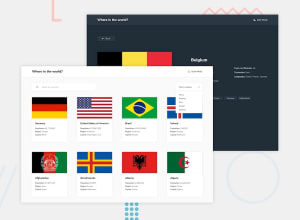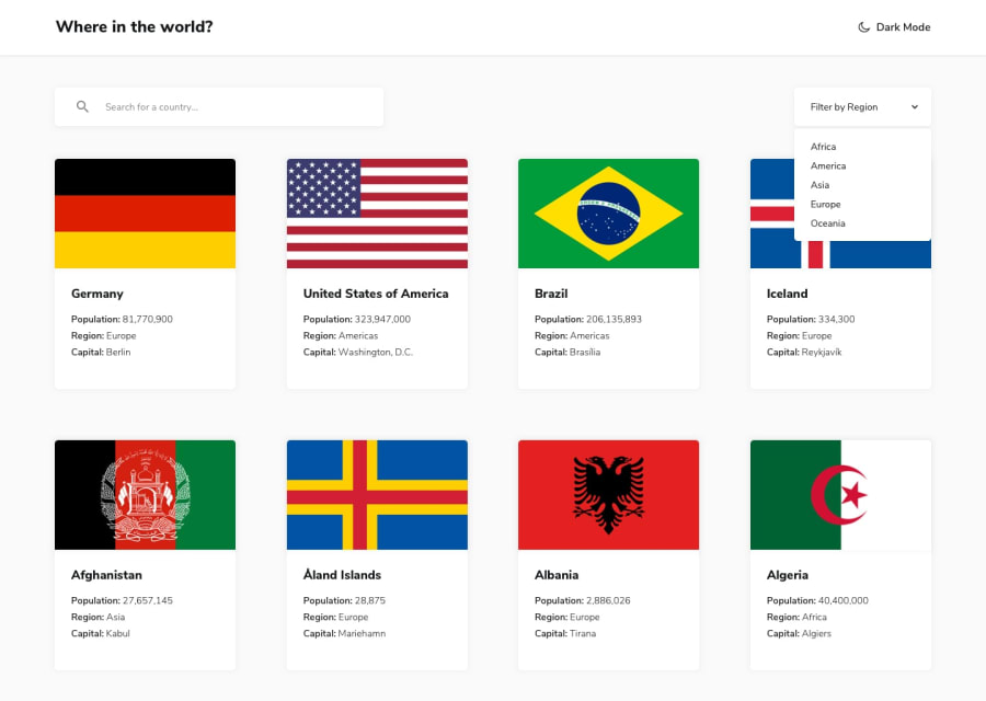
Responsive REST Countries API page with React, React Router, CSS Grid
Design comparison
Solution retrospective
Other features included in this project include color theme toggling, localstorage to save preferences and filters, search term highlighting, and lazy loading.
Could there be a nicer way to display border countries for specific countries? I feel it makes the individual country page look too uneven when border countries exceed 3. Also, I've tried using more modern CSS properties like clamp() to make pages display more responsively. How'd I do?
Any other feedback is appreciated! Thank you!
Community feedback
- @TheDilpPosted over 2 years ago
This is really good, lazy loading is a really nice touch.
For the border countries, you could put the "Border Countries:" heading into one column and the tags into another, so that the tags are always contained in a separate area and don't go underneath the heading. You can then adjust the width of that second area to your liking and use flexbox and wrap to make them look nice.
Marked as helpful1@CallMe-ALPosted over 2 years ago@TheDilp Thank you very much for the feedback and kind compliments! Sorry for the delayed response, life's crazy haha. I'll try implementing your suggestion soon, I always forget about flex-wrap for whatever reason...
Thanks again Mihailo! See you around the site!!
0
Please log in to post a comment
Log in with GitHubJoin our Discord community
Join thousands of Frontend Mentor community members taking the challenges, sharing resources, helping each other, and chatting about all things front-end!
Join our Discord
