
@darkweb907Submitted about 3 years ago

SuiteMel
@SuiteMelAll comments
- P@SuiteMelPosted about 2 months ago
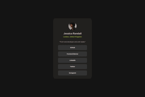
You matched the styles well I think. But I think the background color is wrong. And I'd recommend setting a max width to match the design so the cards don't stretch out as much. Otherwise, good job.
0 - @flaviare1sSubmitted about 1 year agoP@SuiteMelPosted about 2 months ago
You did a really good job matching design. It was difficult to find anything to recommend improving.
I did find one thing was related to responsiveness, and that was that as you make the screen smaller the boxes kind of run into each other. Maybe instead of setting a width you set a max-width so that the card can shrink when they run out space? The newer aspect-ratio utility can also help with maintaining their shape as well if that's a concern as the cards potentially get smaller.
0 - @Edems-DEVSubmitted almost 2 years agoP@SuiteMelPosted about 2 months ago
You did a good job trying to match the layout from the images alone. But, I would highly encourage working on matching colors using a color picker or utilizing colors from the style guide if you aren't sure what the correct color is. Same goes for the font families as well, I believe the style guide in the starter linked to those. Good luck on your CSS journey otherwise!
0 - @pietroBragaAquinoJuniorSubmitted 5 months agoP@SuiteMelPosted about 2 months ago
It looks like this an older project, and when I look at your newer projects I can see you improved your css skills. My biggest critique here and in your other projects is the usage of h1's being on the page multiple times. h1 tags should only be on the page once except in very specific circumstances. With multiple h1's the page isn't semantically correct technically. Otherwise, good luck on your html and css journey!
0 - @PiyushSolanki-hubSubmitted 3 months agoP@SuiteMelPosted 2 months ago
The design is fairly close. Though I noted the location text and button text isn't bold like the design. I would also really recommend making the links from the design actual links instead of just list items, practice styling links is really helpful for future projects and if you don't have a link you can also put a dummy link like "#" in the href value.
0 - @Ashmawy21Submitted 2 months agoWhat are you most proud of, and what would you do differently next time?
Successfully creating a clean, minimalistic UI for the profile with a central layout and responsive buttons.
The hover effects on the buttons improve user interactivity and visual appeal.
Organized and modular code, separating styles into a CSS file for maintainability.
What challenges did you encounter, and how did you overcome them?Centering the container: Aligning the .container element perfectly in the viewport was challenging until using position: absolute combined with transform: translate(-50%, -50%).
Button styling consistency: Achieving a uniform look for buttons across different states required experimenting with padding, borders, and hover effects.
Text alignment and spacing: Balancing margin and padding for proper spacing around text elements took multiple iterations. Overcoming them:
Leveraged browser developer tools to tweak styles in real-time. Referred to documentation like MDN Web Docs and explored community examples for inspiration.
What specific areas of your project would you like help with?Responsiveness: How can I optimize the layout to work better on smaller screens, such as smartphones or tablets? Any tips for implementing a mobile-first design?
Button Styling: Are there better ways to style buttons to achieve a more modern, accessible design? For example, ensuring hover and focus states are intuitive and visually distinct.
Code Optimization: Are there ways to improve my CSS class naming conventions (e.g., BEM) or the structure of my code for scalability and reusability?
Accessibility: What additional steps can I take to make the project more accessible, such as for screen readers or users navigating via keyboard?
P@SuiteMelPosted 2 months agoYou did a good job matching the design. To address your concerns with responsiveness (and to help prevent the use of using absolute again for positioning major page elements) I would recommend looking into the use of a few things.
The max-width style property is great when you have an element that doesn't need to be very big on large screens, but should shrink on smaller screens.
For horizontally centering elements, try using
margin-left: auto; margin-right: auto;this is a helpful style that doesn't conflict with a lot styles, just ensure the element it's applied to is displayed is a block level element iedisplay:block. Flex and grid are also block level elements.CSS Grid and/or CSS flex can help with help with vertically centering the page as well. I'd recommend looking into those as the best property to use in conjunction with those is
align-items: center;.To briefly address the buttons, you've done everything right, but if you'd like to avoid setting a width in the future you can set them to
display:block;and this will make them the same width as their parent. Also you can look into the appearance property if you were struggling with removing the browsers default button styles.Hope this helps, your code shows an understanding of the properties that you are presently using and with some research into these properties I think it can elevate your code to the next level.
Marked as helpful0 - @BrunoChabariberySubmitted 11 months agoWhat are you most proud of, and what would you do differently next time?
Proud to use figma by the first time to see the exact size of some items, it took some time, but i did it
What challenges did you encounter, and how did you overcome them?Any big difficulty
What specific areas of your project would you like help with?None
P@SuiteMelPosted 11 months agoGood job at making the card consistently responsive. Design also matches almost perfectly but the last image has extra bottom margin that was applied to it since classes weren't used for the images. For future reference I would consider looking at this card and imagining the issues or problems you would run into if you have this card on a page multiple times. For example utilizing id's for your article-container and article-content may cause you issues with maintaining semantic html in the future. Overall though, other than recommending less id's and more classes great job.
0 - @tsednick9821Submitted 12 months agoWhat are you most proud of, and what would you do differently next time?
Responsiveness
What challenges did you encounter, and how did you overcome them?Learn more css syntax as I don't know most of the syntax to use to design the html
What specific areas of your project would you like help with?What syntax to use
P@SuiteMelPosted 12 months agoWhen I think of responsiveness I fall can fall into the hole of only using vh, vw, or percentages. But, you can utilize max-width with the size set in px's or rem's for items if you want to maintain responsiveness and keep an element small on a big screen. You card gets very skinny as the screen gets smaller until you hit mobile, which then gets very wide, so this could help with a consistent look on different screen sizes. Only other suggestion, is look into a css reset and minimize the use of !important in css. It's usually not necessary.
Marked as helpful0