


@carolsoutinhoSubmitted 2 months ago
What specific areas of your project would you like help with?
I would like help on how to centralize the entire container
Responsiveness: How can I optimize the layout to work better on smaller screens, such as smartphones or tablets? Any tips for implementing a mobile-first design?
Button Styling: Are there better ways to style buttons to achieve a more modern, accessible design? For example, ensuring hover and focus states are intuitive and visually distinct.
Code Optimization: Are there ways to improve my CSS class naming conventions (e.g., BEM) or the structure of my code for scalability and reusability?
Accessibility: What additional steps can I take to make the project more accessible, such as for screen readers or users navigating via keyboard?
responsive pls check it
and what is the best tags i can use
and font type and size also
I would like help on how to centralize the entire container
edit your code with this
body {
    font-family: 'Barlow Semi Condensed', sans-serif;
    background-color: var(--Light-grayish-blue);
    color: white;
    display: flex;           /* Use Flexbox */
    justify-content: center; /* Center horizontally */
    align-items: center;     /* Center vertically */
    min-height: 100vh;       /* Ensure the body takes up full viewport height */
    padding: 0;              /* Remove padding to prevent any offset */
}
and tell me what is happen & if you don't understand tell me to explain it to you more
Overall Thoughts: Nice job! I can tell you've put a lot of effort into this. The design is clean, simple, and looks good overall. There are a few things you could tweak to make it even better, especially for responsiveness and accessibility.
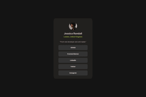
"Profile picture", try something like:
<img src="./assets/images/avatar-jessica.jpeg" alt="Profile photo of Jessica Randall, Front-end Developer from London">
The flexbox layout works well, but the .content container's width: 120% might stretch it out too much. Maybe try 100% or max-width instead so it doesn't break the layout on different screen sizes.
For the image, instead of width: 50%, try a fixed pixel value like 150px. It’ll help keep the image size consistent no matter the screen size.
@media (max-width: 768px) {
  .content {
    padding: 5%;
    width: 100%;
  }
}
The font choices are great, but the paragraph text might be a little too light with font-weight: 300. Try switching it to font-weight: 400 to make it easier to read:
p {
  font-weight: 400;
}
For the headings (h2 and h4), adding a little more space between them would make it feel more balanced. Maybe something like margin-top: 1rem; would help.
.github:focus,
.frontend:focus,
.linkedin:focus,
.twitter:focus,
.instagram:focus {
  outline: 2px solid hsl(75, 94%, 57%);
}
gap property in the .bottom container to space them evenly:
.bottom {
  display: flex;
  flex-direction: column;
  gap: 10px;
}
aria-labels to the buttons. That way, screen readers will be able to read out what each button is for. For example:
<div class="github" aria-label="GitHub Profile">GitHub</div>
You’re on the right track! The design is simple, stylish, and looks great. With just a few tweaks for mobile responsiveness, text readability, and accessibility, it’ll be even better. Keep up the awesome work!
and ensure it aligns with the provided style guide:
main container.@media (min-width: 768px) { /* Adjust layout for tablets and larger screens */ } @media (min-width: 1440px) { /* Adjust layout for desktop */ }
hsl(47, 88%, 63%)hsl(0, 0%, 100%)hsl(0, 0%, 42%)hsl(0, 0%, 7%)This consistency will ensure the design matches the provided style guide.
Figtree font is correctly imported, and font sizes are consistent for the most part.16px for readability, as per the style guide.500 (light)800 (bold)body { font-size: 16px; /* Set the font size to 16px for body text */ } h1, h2, h3 { font-weight: 800; /* Use bold for headings */ }
gap property within flex containers for better spacing control..card__button:hover {
background-color: darken(var(--clr-yellow), 10%); /* Make the button darker on hover */
}
alt attributes to the images to improve accessibility:
<img src="assets/images/illustration-article.svg" alt="Illustration of a blog article" class="card__main-image">
<img src="assets/images/image-avatar.webp" alt="Avatar of Greg Hooper" class="card__avatar">
card__main-description) remains legible by tweaking opacity if needed, especially when viewed on different backgrounds.Overall: You’ve done a great job following the structure and creating a visually appealing layout. With a few tweaks to color accuracy, typography, spacing, and responsiveness, it will align perfectly with the style guide. Keep up the great work!
great job sis :)
let me give you some advises
Semantic HTML
<main> tag for content structure, but replacing the <div class="container"> with a <section> would improve semantics. The alt text for the QR code image is descriptive, which is excellent for accessibility.Accessibility
em or rem units for font sizes could enhance accessibility across devices.Responsive Layout
Code Structure
Outfit Thin is undefined. Consider using a Google Fonts import for accuracy. Comments in the CSS could make the structure easier to follow.Design Consistency
box-shadow for better interactivity could enhance the user experience.Keep going
great job brother ;)
let me give you some tips and greets
Semantic HTML
<div> around the content with <main> could enhance semantics. Adding a more descriptive alt for the QR code image would also improve accessibility.Accessibility
alt text and ensuring sufficient contrast for text would enhance accessibility further.Responsive Layout
flexbox. The card remains centered and scales well.Code Structure
.card or .text would improve readability and maintainability.I’m proud of how the card looks great on all screen sizes, especially mobile, and how I made it accessible with proper alt text and a focus state.
What challenges did you encounter, and how did you overcome them?Next time, I would focus on optimizing my code further. This includes reducing repetition in CSS by using more reusable classes and variables.
What specific areas of your project would you like help with?


