

Design comparison

Community feedback
- @Ashmawy21Posted 2 months ago
Overall Thoughts: Nice job! I can tell you've put a lot of effort into this. The design is clean, simple, and looks good overall. There are a few things you could tweak to make it even better, especially for responsiveness and accessibility.
1. HTML Structure:
- Everything looks great in terms of structure! The alt text is a nice touch for accessibility, but it could be more descriptive. For example, instead of just saying
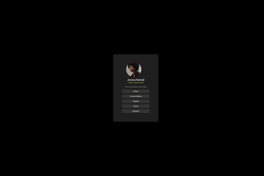
"Profile picture", try something like:<img src="./assets/images/avatar-jessica.jpeg" alt="Profile photo of Jessica Randall, Front-end Developer from London">
2. CSS and Layout:
-
The flexbox layout works well, but the
.contentcontainer'swidth: 120%might stretch it out too much. Maybe try100%ormax-widthinstead so it doesn't break the layout on different screen sizes. -
For the image, instead of
width: 50%, try a fixed pixel value like150px. It’ll help keep the image size consistent no matter the screen size.
3. Responsiveness:
- Right now, the layout looks great on desktop, but for mobile, it feels a little cramped. A quick fix would be using media queries to adjust the layout:
@media (max-width: 768px) { .content { padding: 5%; width: 100%; } } - For the text, it’s a bit small on mobile, so maybe bump up the font size a little to make it easier to read on small screens.
4. Typography:
-
The font choices are great, but the paragraph text might be a little too light with
font-weight: 300. Try switching it tofont-weight: 400to make it easier to read:p { font-weight: 400; } -
For the headings (
h2andh4), adding a little more space between them would make it feel more balanced. Maybe something likemargin-top: 1rem;would help.
5. Button Styling:
- I love the hover effects! It would be awesome to add focus states for keyboard users as well. Here’s a quick way to do that:
.github:focus,
.frontend:focus,
.linkedin:focus,
.twitter:focus,
.instagram:focus {
  outline: 2px solid hsl(75, 94%, 57%);
}
6. Spacing & Alignment:
- The layout is looking good, but you could make it even better by adding consistent spacing between the social media buttons. You can use the
gapproperty in the.bottomcontainer to space them evenly:.bottom { display: flex; flex-direction: column; gap: 10px; }
7. Accessibility:
- Great job on adding the alt tag! To make things even more accessible, you could add
aria-labelsto the buttons. That way, screen readers will be able to read out what each button is for. For example:<div class="github" aria-label="GitHub Profile">GitHub</div>
8. A Few Other Tweaks:
- The contrast between the text and background is good, but you might want to double-check that it’s accessible for people with visual impairments. Making sure the colors meet WCAG guidelines would be a good move.
- Test the layout on smaller screens and various resolutions to make sure nothing gets cut off or looks weird.
You’re on the right track! The design is simple, stylish, and looks great. With just a few tweaks for mobile responsiveness, text readability, and accessibility, it’ll be even better. Keep up the awesome work!
0 - Everything looks great in terms of structure! The alt text is a nice touch for accessibility, but it could be more descriptive. For example, instead of just saying

Please log in to post a comment
Log in with GitHubJoin our Discord community
Join thousands of Frontend Mentor community members taking the challenges, sharing resources, helping each other, and chatting about all things front-end!
Join our Discord