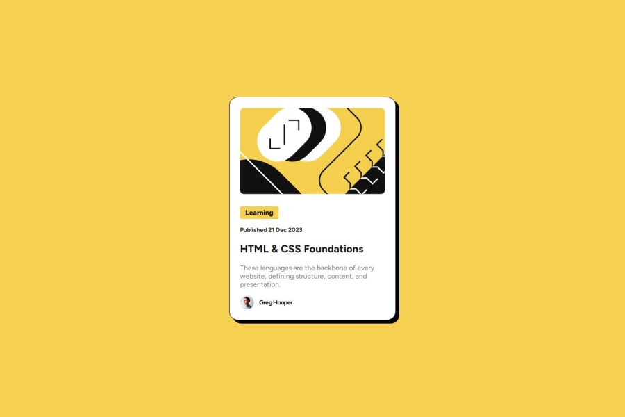
Made with nested CSS and figma to see the exact size of some items


Design comparison

Solution retrospective
Proud to use figma by the first time to see the exact size of some items, it took some time, but i did it
What challenges did you encounter, and how did you overcome them?Any big difficulty
What specific areas of your project would you like help with?None
Community feedback
- P@SuiteMelPosted 11 months ago
Good job at making the card consistently responsive. Design also matches almost perfectly but the last image has extra bottom margin that was applied to it since classes weren't used for the images. For future reference I would consider looking at this card and imagining the issues or problems you would run into if you have this card on a page multiple times. For example utilizing id's for your article-container and article-content may cause you issues with maintaining semantic html in the future. Overall though, other than recommending less id's and more classes great job.
0@BrunoChabariberyPosted 11 months ago@SuiteMel Yea, I noticed it shortly after I sent the project, I corrected it on Github. I generally make extensive use of classes in my projects, this time I decided to give greater visibility to id's 😅. Thanks for the observations
0

Please log in to post a comment
Log in with GitHubJoin our Discord community
Join thousands of Frontend Mentor community members taking the challenges, sharing resources, helping each other, and chatting about all things front-end!
Join our Discord