Open to any advice.
SayedM009
@SayedM009All comments
- @DAJ350Submitted 7 months agoWhat specific areas of your project would you like help with?@SayedM009Posted 7 months ago
Good job, I think you need to use line-height to make it more fit
0 - @jevcenkokozlovskaSubmitted 7 months ago@SayedM009Posted 7 months ago
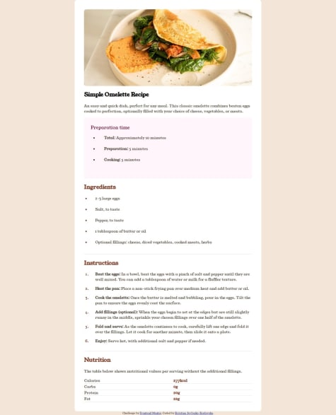
First thing first Good job, But it will be better to add some margin from both sides top and bottom on the large screens and some padding to the table will be awesome
0 - @GatdeyummSubmitted 7 months ago
- @nandiniindraleSubmitted 7 months ago
- @GiorgiBebiaSubmitted 7 months ago@SayedM009Posted 7 months ago
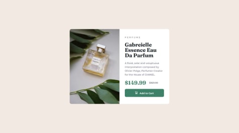
You can use Flex in CSS to make the card in the middle of the page
0


