Design comparison
SolutionDesign
Please log in to post a comment
Log in with GitHubCommunity feedback
- @SayedM009
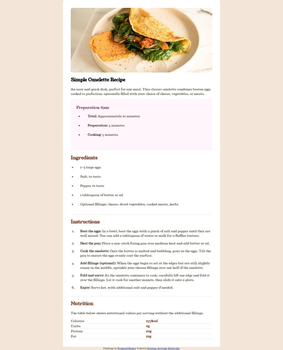
First thing first Good job, But it will be better to add some margin from both sides top and bottom on the large screens and some padding to the table will be awesome
Join our Discord community
Join thousands of Frontend Mentor community members taking the challenges, sharing resources, helping each other, and chatting about all things front-end!
Join our Discord
