

Design comparison

Please log in to post a comment
Log in with GitHubCommunity feedback
- P@Stroudy
Hello again, Fantastic effort on this! You’re really nailing it. Just a few things I noticed that could make it even better…
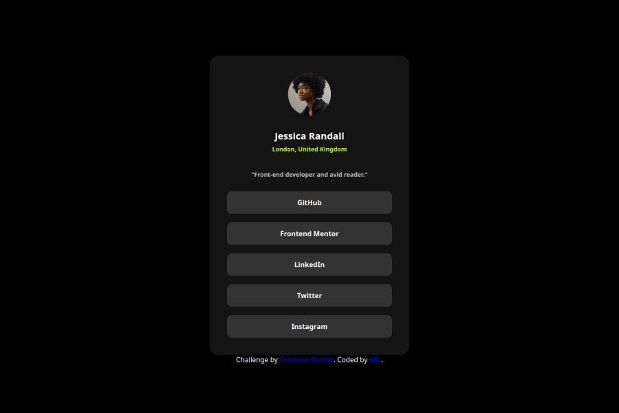
- I would put these into a
<ul> <li>, and the text should be wrapped with a<a>so it is accessible with a keyboard using the tab key, Using an<a>tag for navigation is semantically correct, improves accessibility for screen readers, and ensures consistent behavior across browsers, unlike a<button>or a<div>not intended for links.
<div class="row"> <a target="_blank" href="https://github.com/" class="btn github-link"> GitHub </a> <a target="_blank" href="https://www.frontendmentor.io/" class="btn mentor-link"> Frontend Mentor </a> <a target="_blank" href="https://www.linkedin.com/" class="btn li-link"> LinkedIn </a> <a target="_blank" href="https://www.twitter.com/" class="btn Twitter-link"> Twitter </a> <a target="_blank" href="https://instagram.com/" class="btn Instagram-link"> Instagram </a> </div>-
Using a full modern CSS reset is beneficial because it removes default browser styling, creating a consistent starting point for your design across all browsers. It helps avoid unexpected layout issues and makes your styles more predictable, ensuring a uniform appearance on different devices and platforms, check out this site for a Full modern reset
-
While
pxis useful for precise, fixed sizing, such asborder-width,border-radius,inline-padding, and<img>sizes, it has limitations. Pixels don't scale well with user settings or adapt to different devices, which can negatively impact accessibility and responsiveness. For example, usingpxfor font sizes can make text harder to read on some screens, Check this article why font-size must NEVER be in pixels. In contrast, relative units likeremand adjust based on the user’s preferences and device settings, making your design more flexible and accessible. Usepxwhere exact sizing is needed, but prefer relative units for scalable layouts. If you want a deeper explanation watch this video by Kevin Powell CSS em and rem explained. Another great resource I found useful is this px to rem converter based on the default font-size of 16 pixel. -
Line height is usually unitless to scale proportionally with the font size, keeping text readable across different devices. Best practice is to use a unitless value like
1.5for flexibility. Avoid using fixed units likepxor%, as they don't adapt well to changes in font size or layout.
I hope you found this advice helpful! Keep up the great work, You’re doing amazing, and I can’t wait to see what you create next. Happy coding! 🚀
Marked as helpful - I would put these into a


Join our Discord community
Join thousands of Frontend Mentor community members taking the challenges, sharing resources, helping each other, and chatting about all things front-end!
Join our Discord