
RobinsonGabriel
@RobinsonGabrielAll solutions
- Submitted 6 months ago
Blog Card W/ light animation
- HTML
- CSS
I think I mostly see where I would like to work on the design aspect: just making sure my sizing is actually cooperating with the screen without distorting the elements too much. If there's anything that anyone else catches however I'm more than happy to hear it
- Submitted 6 months ago
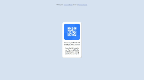
QR Code, standard HTML and CSS
- HTML
- CSS
Any suggestions for making setting up the components themselves would be greatly appreciated. I find I'm often kind of trying a bunch of possible solutions but it's really just guessing (case in point I was trying to get the same component to respond to both flexbox and grid, which if I understand correctly after some reading will often have them trying to overwrite each other?)
Do you find yourself going from outside in, grid or flex first? Neither? etc.