Not Found
Not Found
Not Found
Not Found
Not Found
Not Found
Not Found
Not Found
Not Found
Not Found
Not Found
Not Found
Not Found
Not Found
Not Found
Not Found
Not Found
Not Found
Not Found
Not Found

All comments

  • devguff 10

    @devguff

    Submitted

    What are you most proud of, and what would you do differently next time?

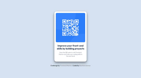
    This is my first frontend mentor solution. I really tried to make the solution to be as easy to change as possible using css variables. I'm not sure if I am using all the recommended best practices for things. For example, I think there should be some sort of css property for ensuring the screen width can never be less than the width of your component. Not really sure what this is right now but just trying to get used to flow of how to build this type of stuff.

    What challenges did you encounter, and how did you overcome them?

    Figuring out how to get the included attribution required me to ai search for a solution. I understand how it works but it feels like there may be a better way. Also the spacing around items was a bit tricky.

    What specific areas of your project would you like help with?

    Know what best practices I could be using that I am not. Want my solutions to be less hacky in the future.

    @RobinsonGabriel

    Posted

    Hi dev,

    I don't think it's a terrible crack at it at all really. Esp if you don't do this stuff a ton it can take time to adjust. Points for using variables as it will make life easier on larger sheets, and I forgot CSS even supported them until I did a few designs myself (we all learn at our own pace... mine's just a bit unique.)

    That said, what do you think is hackney in your design? Generally what's To answer the question around the component fitting the screen: you are probably thinking of working with a media query.

    https://www.w3schools.com/css/css3_mediaqueries.asp

    ^^short explanation of them. So for example: you might have your component set to a certain unit as your minimum, generally when it starts to mess around with the text orientation, pic size, etc.

    Hopefully this gives you something to chew over

    0
  • @kinlearn

    Submitted

    What are you most proud of, and what would you do differently next time?

    Nothing as such. I just could do it quite perfectly..

    What challenges did you encounter, and how did you overcome them?

    I thought it was a very easy project, but I need to work on my speed. Also,

    • doing height : 100vh makes the body tag to have a scrollbar.
    • centering the div using flexbox for larger screens was challenging

    What specific areas of your project would you like help with?

    min-width, max-width, etc. filter() etc.

    @RobinsonGabriel

    Posted

    Hi Kin,

    Yeah that's pretty much a perfect 1 for 1 from what I can see, so points! What are you curious about with max-width and max-height in particular? I may have some good resources that helped me/I might just know the answer off the cuff.

    Marked as helpful

    1
  • Bautydev 20

    @Bautydev

    Submitted

    What are you most proud of, and what would you do differently next time?

    I am proud to have made it responsive since it is something that is a bit complicated for me at the moment. Next time I would change using CSS Flex for CSS Grid and implement frameworks like bootstrap, sass, etc.

    What challenges did you encounter, and how did you overcome them?

    I encountered the challenge of putting a small shadow on the container to make it look more realistic, but I solved it by researching and becoming better informed.

    What specific areas of your project would you like help with?

    I would like help with making it responsive, since I know there are other easier ways to do it with media queries.

    @RobinsonGabriel

    Posted

    Overall you matched it pretty well when using even the really small viewports chrome will give you in inspect element, so the size would probably be okay, but of course it looks a little odd at some dimensions.

    One thing that I'd point out is your container has px units, which don't scale with the screen. Nothing wrong with that, if you change it to fr, %, etc it's clear sometimes that's not ideal.

    This list here is pretty exhaustive of which units are absolute and which are relative: W3Schools is also just a nice resource if you forget any syntax since theres a lot

    @media(min-width: 15em){ width: 10em; }

    Here's an example of the short query I used for my version of this. It's pretty simple just because I couldn't think of a need to have it respond at a scale any smaller. It's imperfect, but you could also try using a min-width, max-width, min-height, or max-height and use relative units to make some component scale how you see appropriate. I hope that gives you some stuff to fiddle with!

    0
  • @MisterSixz

    Submitted

    What are you most proud of, and what would you do differently next time?

    I've learnt about positioning and image sizing, I'll try to use other different tools next time.

    What challenges did you encounter, and how did you overcome them?

    The positioning and sizing is very hard for me, so I did google so many times for helps.

    What specific areas of your project would you like help with?

    About CSS box model and positioning

    @RobinsonGabriel

    Posted

    Hi Mistersixz,

    Looks pretty good, image sizing and getting everything to cooperate is surprisingly hard right? I spent... an embarrassing amount of time the first run I had with this trying to get it to cooperate.

    Are you mainly thinking about how to get something to stay in the absolute center of the screen when you talk about positioning? This is part of what I used that W3C's documentation gives as an example: position: absolute; top: 50%; left: 50%; transform: translate(-50%, -50%);

    Position is necessary for the top and left to do anything. It's a bit rigid, but if say, this was the only thing on the page it would do its job.

    I honestly don't think about the box model a lot but I can maybe try to give some ideas: what element is confusing? Is it like what padding vs margin does? Or..?

    Marked as helpful

    1
  • @RobinsonGabriel

    Posted

    Hi JAMB,

    I copy-pasted the solution onto my editor because it's doing something weird on the .io site still where it won't render the qr code. Seems it hasn't updated to include the path in your github code just yet. Looks great when run though!

    Have you put CSS in a separate file yet? I would encourage it just because it can be a bit hard to read/update inline js/css especially when it gets over a few lines. Granted this is just for a prototype component so it's not the end of the world or anything.

    0