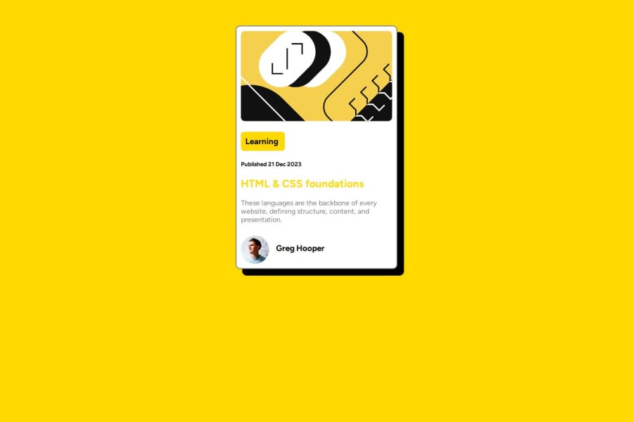


Design comparison

Solution retrospective
I feel I'm pretty happy overall with this. While it went out of the scope of the design a bit, I added some @keyframe to one of the header elements, partly for comfort reasons as sticking with the white had some... drawbacks, but I also just wanted the excuse to see how fading looked for hover. I can't comment how this would affect performance on a full website, but it certainly looks nice in a prototype
What challenges did you encounter, and how did you overcome them?It's not in the code but I tried using grid also to make the layout, did not work at all. Not a huge deal I just didn't have any luck getting the columns to work out how I wanted to. Otherwise it was more of the same from the previous one I did, though I had a better sense of how to use the display: options.
I never noticed but the inspect element function will also tell you which styles aren't getting used on the page for x y or z reason, which was a really nice thing to see because I didn't know about some of the elements that clash. (Easiest being putting grid and flex elements on the same level of the page.)
What specific areas of your project would you like help with?I think I mostly see where I would like to work on the design aspect: just making sure my sizing is actually cooperating with the screen without distorting the elements too much. If there's anything that anyone else catches however I'm more than happy to hear it
Community feedback
Please log in to post a comment
Log in with GitHubJoin our Discord community
Join thousands of Frontend Mentor community members taking the challenges, sharing resources, helping each other, and chatting about all things front-end!
Join our Discord