@eenaree
Latest solutions
Latest comments
- @RayaneBengaoui
안녕하세요 Nari Lee,
Congrats for completing this challenge ! 🙂
I'd like to suggest :
-
Add some CSS transition to make your hover animations smoother. For example It could be something like
transition : all 0.3s easewhere "all" is the CSS property you want to animate. This article is great also to understand how and when to use ease effects (especially ease-in and ease-out) : https://css-tricks.com/ease-out-in-ease-in-out/ -
I would personally try to break down the Calculator component into smaller pieces to make it simpler to read. Here I can see multiple useEffect hooks, thus they could be separated into other components that only do only 1 thing.
-
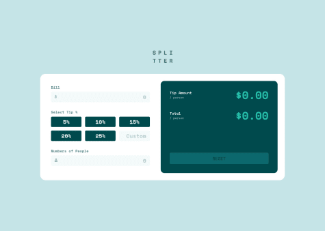
It's great that you took the time to handle non authorized values such as 0 persons or 0 dollars, but to push it even further you could handle the situation when there are too many people compared to the bill amount. If I put 3$ with 1000 persons the tip amount and total are equal to 0.
Otherwise, well done for the challenge and it's also responsive, which is great !
Have a nice day ! 🌞
-
- @MehmetCanBOZ@RayaneBengaoui
Hello Mehmet Can BOZ,
Congrats for completing this challenge ! 🙂
I'd like to suggest :
-
I don't think you are using the correct font from the design (Kumbh Sans)
-
Some text colors/weights are a bit off compared to the design
-
I would add
object-fit : coverto your slider image to make sure the image isn't stretched. -
When an image is opened from the slider, I think you should make the background darker for a better contrast.
-
On the mobile menu, I would add
cursor : pointerinstead of text here.
Have a nice day ! 🌞
Marked as helpful -
- @ApplePieGiraffe@RayaneBengaoui
Hello APG ! 👋
I'm a bit late on this one but as everyone already said this looks AMAZING and as always, the animation is so smooth 🤩.
I wasn't ready to see me on the scroll back haha, nice easter egg, thanks a lot ! 😊
Have a nice day ! 🌞
- P@Lusk1nha@RayaneBengaoui
Hello Lucas Pedro,
Congrats for completing this challenge and trying out React! 🙂
For a little project like this one, it's quite heavy, but when you'll do bigger projects with React you'll see how enjoyable is it to re-use components and manage state ! 😉
Here I would just suggest to use
mix-blend-mode: multiplyon your image rather thanfilterto mix it with the purple background and thus get closer to the design.Overall, well done for the challenge and happy coding ! 😃
- @kadheryna@RayaneBengaoui
Hello Kadheryna,
Congrats for completing this challenge ! 🙂
I'd like to suggest :
-
Your
background-sizeproperty is invalid. Instead of havingbackground-position: top-left, bottom-rigth;, it should bebackground-position: left top, right bottom;. There was a typo on "right" and there is no need to add "-" between values. -
Add
min-height : 100vhto yourbody. It will make sure that your body covers the entire viewport, thus, your second background image can position bottom right correctly. -
Modify the
font-weightproperty of your<h1>and the text in the reviews to match better the design. -
Use the
max-widthproperty on your boxes so that they don't overscale on big screens.
Overall, well done for the challenge and happy coding ! 😃
-
- @josuke0227@RayaneBengaoui
Hello Josuke,
Congrats for completing this challenge ! 🙂
It looks super nice ! I really like the animations on scrolling, I saw you used AOS, I've never tried it before, is it great ?
I also love the way your form inputs behave with the label moving to the top ! How did you make this effect ? I'm curious about that ! 😁
Have a nice day ! 🌞