Officelite coming soon site with React, styled-component, and Joi.
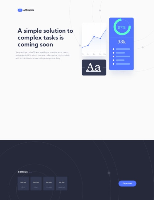
Design comparison
Solution retrospective
It was the first time for me to build multi-background web site. The approach I took was to build the whole contents except background, then encapsulate them in the <ContentsWrapper> element, then put it into entire content container <Container> which has background element <Background > with "absolute" position like below. I'm appreciate if there are any good approaches to build multi-color background.
<Container style={{ height: "total height of <ContentsWrapper>" }}> <Background /> // contains top BG and bottom BG
// put the content onto Container which has background
<ContentsWrapper style={{position: "absolute", top: "0", right: "0"}} >...contains whole content </ContentsWrapper> </Container>
Finally, for signup page, I decided to give boolean attribute "signup" to elements which have similar style between homepage and signup page in order to make my code DRY, but it resulted in repetitive use of "signup={signup}" for elements, also I end up putting so much "${props => props.signup ? signupStyle : homepageStyle}" for styled components.
I decided to take this approach because I didn't want to make similar components and I felt that Context API is a bit exaggerating because the "signup" prop drilling was just few levels down.
If there are any questions or unclear points, feel free to ask.
Thank you for reading :)
Community feedback
- @RayaneBengaouiPosted over 3 years ago
Hello Josuke,
Congrats for completing this challenge ! π
It looks super nice ! I really like the animations on scrolling, I saw you used AOS, I've never tried it before, is it great ?
I also love the way your form inputs behave with the label moving to the top ! How did you make this effect ? I'm curious about that ! π
Have a nice day ! π
1@josuke0227Posted over 3 years ago@RayaneBengaoui
Hello Rayane, It's kind an honor that I've got a comment from great programmer like you!
I don't know about the animation library in depth but I DO recommend AOS because all you need to do is just install package, import CSS and module, put attributes to elements and thats it!!
Here is the example of installation of AOS for React. https://github.com/michalsnik/aos/issues/49
Regarding to the input form, the logic is simple, the text which goes up and down is <label>, not placeholder. You can implement this form giving the <label> horizontal position where you want label to move, apply the style conditionally only when the form is focused and form has a value (length).
To combine the action of user's focus on <form> and the animation of <label> which are totally different elements, I used "~" selector in ":focus" to grab <label>. Therefore <label> element is under the <form> one.
I apologise if my explanation was badπ
Have a good day too!
1@RayaneBengaouiPosted over 3 years ago@josuke0227 Ho thank you ! (I wish I was a great programmer π)
Then I'll definitely check AOS someday, it looks funny to use !
I understand your process, thanks for taking the time to explain it to me, It's really kind from you π
Hope to see you soon on another challenge, δ»ζ₯ι εΌ΅γ£γ¦γγ γγ π
1@josuke0227Posted over 3 years ago@RayaneBengaoui
I used angle bracket in the last message but this text box drops all the characters wrapped by angle bracket when submittingπ±
Still, itβs a relief to hear that my explanation made sense.
Thank you for taking your time and reading it.
γδΊγγ«ι εΌ΅γγΎγγγπͺ
1
Please log in to post a comment
Log in with GitHubJoin our Discord community
Join thousands of Frontend Mentor community members taking the challenges, sharing resources, helping each other, and chatting about all things front-end!
Join our Discord