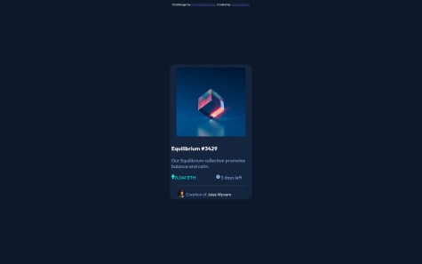
Fell Free to provide your feedback..
Naveen Gumaste
@NaveenGumasteAll comments
- @someshwari-rudraSubmitted almost 3 years ago@NaveenGumastePosted almost 3 years ago
Hello Someshwari rudra ! Congo 👏 on completing this challenge
Let's look at some of your issues, shall we:
-
Always use
h1first and thenh2,h3and so on -
Headings should only increase by one use h1 first then h2 etc..
If you use vs code the check this article
happy Coding😀
1 - @niteshh-sSubmitted almost 3 years ago
I am new to Web development. I Made this website using beginner level HTML and CSS. No bootstrap used. It appears perfect on desktop screen. I would really appreciate if anyone can suggest me how can i make this website completely responsive.
@NaveenGumastePosted almost 3 years agoHello Nitesh Singh ! Congo 👏 on completing this challenge
Let's look at some of your issues, shall we:
-
Always use
h1first and thenh2,h3and so on -
Headings should only increase by one use h1 first then h2 etc..
-
Warp your card content around the main tag Ex: 👇
<body>
<main class="container">
*all you content here*
</main>
</body>
If you use vs code the check this article
happy Coding😀
Marked as helpful0 - @ilhanhakan-kocSubmitted almost 3 years ago
Any comments or suggestions are welcome! :)
@NaveenGumastePosted almost 3 years agoHay ! Hako Good Job on challenge
-
Always use
h1first and thenh2,h3and so on -
Headings should only increase by one use h1 first then h2 etc..
If you use vs code then check this article
Keep up the good work!
Marked as helpful1 -
- @Yaser47Submitted almost 3 years ago
Leave Any Advice
@NaveenGumastePosted almost 3 years agoHello Yaser47 ! Congo 👏 on completing this challenge
Let's look at some of your issues, shall we:
-
Always use
h1first and thenh2,h3and so on -
Headings should only increase by one use h1 first then h2 etc..
happy Coding😀
Marked as helpful0 -
- @Nebil-NejSubmitted almost 3 years ago
Like always, any and all comments are welcome.
@NaveenGumastePosted almost 3 years agoHello Nebil Nejmudin ! Congo 👏 on completing this challenge
Let's look at some of your issues, shall we:
-
Payment button text is just white color.
-
annual plan bg color is given in the style-guide.md
happy Coding😀
1 -
- @roshankcpkrSubmitted almost 3 years ago
Hoping for better suggestions
@NaveenGumastePosted almost 3 years agoHello Roshan K.C ! Congo 👏 on completing this challenge
Let's look at some of your issues, shall we:
-
Add Main tag after body
<main class="container"></main> -
Always use the "alt attribute" and write what img is , and if the img is for decorative then leave it empty but always add it with alt.
happy Coding😀
0 -
- @Blue-CheesecakeSubmitted almost 3 years ago
Is there anything needed to improve? Are there any suggestions for beginners?
@NaveenGumastePosted almost 3 years agoHello SINUT WATTANRPORN ! Congo 👏 on completing this challenge
Let's look at some of your issues, shall we:
-
Add Main tag after body
<main class="container"></main> -
The background color is given in style-guide.md
-
Why us section color is too much light and i know it was not given in style-guide so use color-zilla chrome extension. and you will get the color
-
This is color i used for my solution
--light-cyan: hsl(179, 45%, 52%);check my solution here if needed
happy Coding😀
Marked as helpful1 -
- @nasimabhariSubmitted almost 3 years ago
This is the second project I've done on frontendmentor. I'll be glad to hear any helpful advices!
@NaveenGumastePosted almost 3 years agoHello Nasim Abhari ! Congo 👏 on completing this challenge
Let's look at some of your issues, shall we:
-
Always use
h1first and thenh2,h3and so on
happy Coding😀
Marked as helpful0 -
- @MarcusTuliusCiceronSubmitted almost 3 years ago
Going to as much challenge as possible in the coming weeks month, this the first one I complete.
@NaveenGumastePosted almost 3 years agoHello Ciceron ! Congo 👏 on completing this challenge
Let's look at some of your issues, shall we:
-
Add Main tag after body
<main class="container"></main>
happy Coding😀
0 -
- @eeffoCdecISubmitted almost 3 years ago
Hey everyone! I'm trying to become a front-end developer. This is my first attempt. Please let me know if you have any suggestions. Thank you!
@NaveenGumastePosted almost 3 years agoHello a coffee mug ! Congo 👏 on completing this challenge
Let's look at some of your issues, shall we:
-
Backgound img should be added 'Css'
-
Add Main tag after body
<main class="container"></main>. -
Always use
h1first and thenh2,h3and so on.
happy Coding😀
Marked as helpful0 -
- @nuelobetoSubmitted almost 3 years ago
Hi guys! I would love to get your feedback on my code and ways to improve. Thanks.
@NaveenGumastePosted almost 3 years agoHello Nuel ! Congo 👏 on completing this challenge
Let's look at some of your issues, shall we:
-
Always use
h1first and thenh2,h3and so on -
Add Main tag after body
<main class="container"></main> -
Consider using
h2-h6elements to add identifying headings to all sections.
happy Coding😀
0 -
- @SAIKIRAN3670Submitted almost 3 years ago
This is my first design using html and css. please provide your valuable feedback on this design
@NaveenGumastePosted almost 3 years agoHello Saikiran Rudra ! Congo 👏 on completing this challenge
Let's look at some of your issues, shall we:
-
Add Main tag after body
<main class="container"></main> -
Always use
h1first and thenh2,h3and so on -
Headings should only increase by one use h1 first then h2 etc..
happy Coding😀
1 -


