Mohanad Alrwaihy
@MohanadOOAll comments
- @cluod-AlfakhreSubmitted over 2 years ago@MohanadOOPosted over 2 years ago
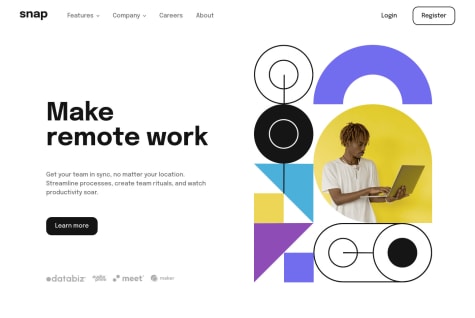
Great design and responsiveness, The animation is beautiful 👍♥
شغل نظيف ما شاء الله , الله يقويك ✌
1 - @emiomacollinsSubmitted over 2 years ago
Any feedback is welcome. Thanks.
@MohanadOOPosted over 2 years agoAmazing Work!
Beautiful transitions and responsiveness keep going 👍
0 - @JouxevSubmitted over 2 years ago@MohanadOOPosted over 2 years ago
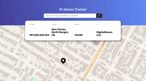
Good Work I like the loading Animation 👍
-
I would suggest that you set the header background size to cover because on my screen the header background was not taking the whole width.
background-size: cover;will do the trick. -
Also I see that you used
justify-content: space-between;in each content container (IP Address, Location, Time Zone, and ISP) It is making a space between the title and the text that is not necessary so I would suggest that you remove for all of them and that will make it look cleaner.
1 -
- @sandlerzSubmitted over 2 years ago
Hi! I appreciated all feedback!
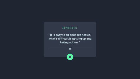
@MohanadOOPosted over 2 years agoGood Work on the Design it looks clean!
By the way, the button does not generate new advice when I clicked on it the problem is from the link you put to fetch data from:
https://cors-anywhere.herokuapp.com/https://api.adviceslip.com/adviceYou can change the link to this one here https://api.adviceslip.com/advice and one more trick is that to add this after the fetch
{ cache: 'no-cache' }for example:fetch('https://api.adviceslip.com/advice', { cache: 'no-cache', })This will decrease the time to show each advice by asking cashes to validate the response with the origin server before reuse.
I don't actually know very well what it is doing 😆 but you can read more about it Here
I hope this feedback helps you fix the request problem in your code and increase the response speed as well ✌
Marked as helpful2 - @naura1835Submitted over 2 years ago@MohanadOOPosted over 2 years ago
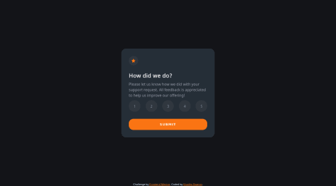
Great Work, I liked how you did the flip animation when pressing the submit button.
I would suggest one more thing that I did is to disable the button when there is no button is selected.
To do that you have first to change
<button></button>to be an<input type="button" value="Submit"/>and probably you have to addtext-align: centerto center the text.After that in your script you can disable the button onload by adding:
const submitbtn = document.querySelector('.submit')
window.onload = () => {
    submitbtn.disabled = true
}
You can style the button when it is disabled in the CSS like this:
.submit:disabled {
    background-color: hsl(25, 97%, 53%, 40%);
    pointer-evnets: none;
}
And finally, when the user clicks on any of the review buttons it should remove the disabled attribute from the submit button it can be done by making it false
submitBtn.disabled = falseI hope this adds something useful for you! 😀👍
Marked as helpful0
