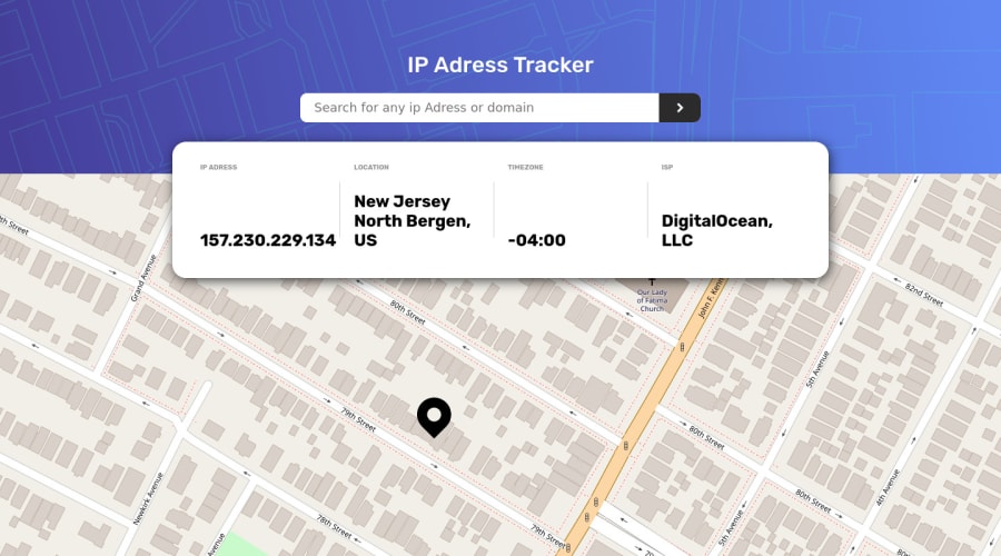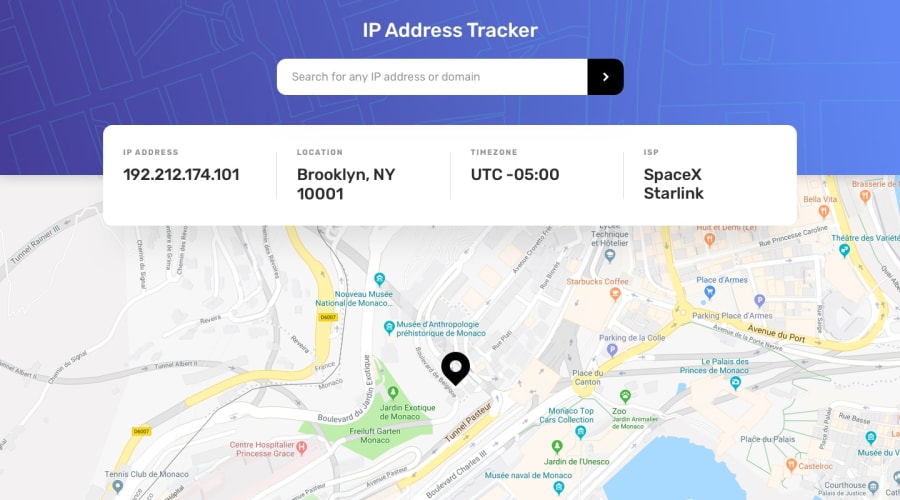
Design comparison
Community feedback
- @MohanadOOPosted about 3 years ago
Good Work I like the loading Animation 👍
-
I would suggest that you set the header background size to cover because on my screen the header background was not taking the whole width.
background-size: cover;will do the trick. -
Also I see that you used
justify-content: space-between;in each content container (IP Address, Location, Time Zone, and ISP) It is making a space between the title and the text that is not necessary so I would suggest that you remove for all of them and that will make it look cleaner.
1@JouxevPosted about 3 years ago@MohanadOO Hi Thank you for your feednack
Actualy the design was made for two different screen 1440px & and 375px,
i justed follewed the instruction given at challenge.
i will change the , justify-content in those containers. thank you very much
i really appreciate your feedback
1 -
Please log in to post a comment
Log in with GitHubJoin our Discord community
Join thousands of Frontend Mentor community members taking the challenges, sharing resources, helping each other, and chatting about all things front-end!
Join our Discord
