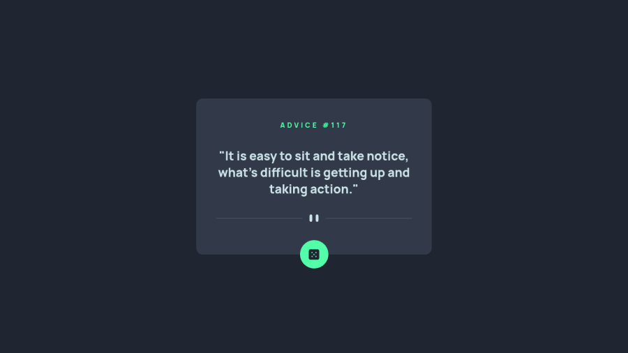
Design comparison
Solution retrospective
Hi! I appreciated all feedback!
Community feedback
- @MohanadOOPosted over 2 years ago
Good Work on the Design it looks clean!
By the way, the button does not generate new advice when I clicked on it the problem is from the link you put to fetch data from:
https://cors-anywhere.herokuapp.com/https://api.adviceslip.com/adviceYou can change the link to this one here https://api.adviceslip.com/advice and one more trick is that to add this after the fetch
{ cache: 'no-cache' }for example:fetch('https://api.adviceslip.com/advice', { cache: 'no-cache', })This will decrease the time to show each advice by asking cashes to validate the response with the origin server before reuse.
I don't actually know very well what it is doing 😆 but you can read more about it Here
I hope this feedback helps you fix the request problem in your code and increase the response speed as well ✌
Marked as helpful2 - @shashreesamuelPosted over 2 years ago
Hey good job completing this challenge
Keep up the good work
Your solution looks great however I think that the title of the card needs to be a bit bigger.
In terms of your accessibility issues simply wrap all your content between main tags
I hope this helps
Cheers
Happy coding 👍
1
Please log in to post a comment
Log in with GitHubJoin our Discord community
Join thousands of Frontend Mentor community members taking the challenges, sharing resources, helping each other, and chatting about all things front-end!
Join our Discord
