


Wesley kaihara• 60
@WesleyKaihara
Submitted
How can I resolve the small responsiveness error, or in a real case it wouldn't affect it?
@MatiX221
@WesleyKaihara
Submitted
How can I resolve the small responsiveness error, or in a real case it wouldn't affect it?
@MatiX221
Posted
Card is small on small screens bc you set card with as 20% so if screen has 200px card will have 40px. You can set card width as something like 20em and if card is too large on small screens just set max-width: 90% or so
Marked as helpful
@gcarter89
Submitted
This is my second submission for this challenge.
While I fulfilled the brief for the project, I wanted to give myself the additional challenge of fulfilling the requirements using a single call to the API.
Rather than calling the API multiple times for fetching country details and when navigating back to the main list of countries. I wanted to have one persistent piece of state that could manage everything.
In the previous submission, I found myself dealing with bad request handling. After a number of calls - potentially down to API call throttling. I found a single call to the API satisfied everything I needed to do. It's made the initial load a little longer, but the navigation and use of the app, very fast afterwards. I'll probably filter the fields in each API request later.
In my next submission, I'll look at component-ising things more!
Any questions or improvements, let me know!
@MatiX221
Posted
Firstly you should read reports.
Secondly you can't unselect continent filter, so if you select europe you can't set it to all.
And thirdly if you have something in search bar and then change region in continent filter. It will show all countries from that continent and not country that you searched from that continent.
@95Fredo
Submitted
Any feedback on my code is much appreciated.
@MatiX221
Posted
Good. Just a few things.
For phones you can set background-size: cover
For desktop you can set backround-size: contain
And it would be better if @media had min-width around 600-1000px. 1440px is too much
@Ascaris29
Submitted
I finished this challenge, however I couldn't keep the background elements in fixed mode and they move when the resolution changes. If someone has an idea..
Thank you for your comments or like
@MatiX221
Posted
Good. Just read report.
And you can set background as
url(images/bg-pattern-top.svg) bottom 50vh right 50vw no-repeat, url(images/bg-pattern-bottom.svg)top 50vh left 50vw no-repeat and it will work
Marked as helpful
@chrischakrit
Submitted
Any feedback/comments are highly appreciated. Thanks you.
@MatiX221
Posted
Good. But <article> should have <h1-6> tag. If it doesn't just use <div>
You're using article:first-child but why, just use <article class="community">
.grid-container has <width: 36%>, but you can just set value like 30em and if you worry you can set max-width:80%
Marked as helpful
@MuhammadRehanEng
Submitted
share your feedback because your feedback is valuable for me..
@MatiX221
Posted
Really good. Just a few things.
You can write css in style.css file and then connect it to your site with
<link rel="stylesheet" href="style.css" />
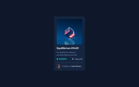
And your site should have at least one h1 tag so you can change
<a href="#">Equilibrium #3429</a> into <h1>Equilibrium #3429</h1>
Marked as helpful
@GSD3v08
Submitted
Hello , this is my second project, could you tell me if there's something that can be improved or what should I learn for future projects?.
Feel free to leave your comments, any help will be appreciate it.
Thank you.
@MatiX221
Posted
Really good. You should have at least one h1 tag.
You can change
<p class="qr-title">Improve your front-end skills by building projects</p>
into
<h1 class="qr-title">Improve your front-end skills by building projects</h1>
And this accessibility issue will disapear.
Marked as helpful
@Mahmoud2227
Submitted
Any Feedback is appreciated! and is my use of rem and em units is right or maybe there is something I need to improve?
@MatiX221
Posted
Website look good, but you should use class and id. When you will be making big project it will help a lot.
@srikargunnam
Submitted
I couldn't achieve the exact color of violet mask which covered the photo, whether my opacity is incorrect or some other issue, on few trail and errors i got close but not exact, would like to hear feedback from anyone who has answer for this or would like to give me any suggestions on areas where i can improve. Thanks in advance :)
@MatiX221
Posted
Generally good. Just a few things. Firstly read ur HTML report and don't make same mistake. Secondly you can use BEM naming, it will help you a lot. And thirdly you really can't find phones with less than 375px width, so making website with less than 375px width just doesn't make sense, so next time make phone version with max-width of around 700px.