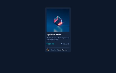
Ainda tenho bastante dúvidas sobre estilizar o site mas aos poucos quero avançar e me tornar uma boa desenvolvedora, aceito dicas
Snow
@LuanS0All comments
- @naiaramdrsSubmitted over 1 year ago@LuanS0Posted over 1 year ago
Olá, Naiara. Tudo bem?
Recomendo que estude um pouco sobre
HTML Semânticoe sobre as tags que podem ser utilizadas para cada estruturação necessária do HTML, tais como:<main>, <article>, <aside>,<section>.Com isso, recomendaria que usasse, para esses casos em específico, os
Grid Layoutsou osFlex Layouts, bem como o estudo dosmin-height: 100vh.Se esse comentário lhe foi útil, siga-me para mais. Até mais...
Marked as helpful0 - @Ozzy-codesSubmitted over 1 year ago
Hey y'all,
I would appreciate if you could take a look at my code for feedback! What best practices have you come across that I'm missing?
I'm especially interested in:
- What tools or resources are you using to ensure your projects are accessible?
- How would you use the CSS property
object-fitin this project, and what are your best use cases of this property? - I've seen a lot of mention of the CSS methodology BEM, and not much of other methodologies on this site, is this method an industry best practice?
Care to see how I approached this project? Take a look at my README
@LuanS0Posted over 1 year agoHey there... What's up?
My name is Luan Souza and I liked his work. But, I have something to add...
- I recommend creating a separate CSS file where it may be possible to establish more readable semantics.
- Try using display flex (justify-content and align-items) to center the card in the center of the image.
I hope I helped... See you later.
0

