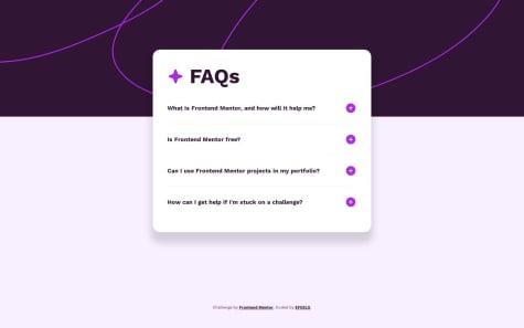
Not Found
Not Found
Not Found
Not Found
Not Found
Not Found
Not Found
Not Found
Not Found
Not Found
Not Found
Not Found
Not Found
Not Found
Not Found
Not Found
Not Found
Not Found
Not Found
Not Found

All comments

  • Roselin Y• 330

    @Vanillatte68

    Submitted

    What are you most proud of, and what would you do differently next time?

    i thought of using a framework to workaround the css grid, but i decided to stick with pure html, css, js. i mostly happy i could make form validation and customizing alert using js. some css element need a workaround using class to get active/focus event work, i'm happy i got new insight from that.

    What challenges did you encounter, and how did you overcome them?

    making form validation function was not quite hard but when you don't want to use browser's default alert, you had to write more code and adding more element in the page. styling the css based on certain function or event is also challenging.

    What specific areas of your project would you like help with?

    i wonder if there is more efficient or shorter function to implement validation for each field in the form

    Levi Kuhaulua• 220

    @LeviKuhaulua

    Posted

    Heyo, it might be easier to group all related input elements (i.e text) together. You can do this by using the querySelectorAll(selectors) function and putting your CSS selectors inside, at that point you can use something such as a forEach loop to handle validation for these elements.

    Marked as helpful

    0
  • @marsh189

    Submitted

    What are you most proud of, and what would you do differently next time?

    I am proud that I was able to get the components looking correct without much issue. Most CSS fields are getting easier to fill out without any resources to allow me to get the look I am trying to get. As a challenge, I think next time, I would try to use flexbox instead.

    What challenges did you encounter, and how did you overcome them?

    I was still getting caught up with getting spacing between sections correct. Also, I was unable to get the main content holder using flex without having items overlapping.

    What specific areas of your project would you like help with?

    I would like to learn best practices for making items more responsive.

    Levi Kuhaulua• 220

    @LeviKuhaulua

    Posted

    Howzit, if you are a visual learner, this video helped me to understand Flex and how to implement it in my HTML and Style sheets.

    0
  • JackB91• 150

    @JackB91

    Submitted

    What challenges did you encounter, and how did you overcome them?

    I am having some issues styling the background image to only take up the top part of the viewport.

    What specific areas of your project would you like help with?

    Why when I click on the plus image it no longer gets the desired images from the correct source and instead displays the alt text?

    Levi Kuhaulua• 220

    @LeviKuhaulua

    Posted

    Howzit, for the background, you can make use of the following:

    body {
    background: url(path/to/background-image/), [background-color]; 
    background-size: 100%; 
    background-repeat: no-repeat; 
    }
    

    This will ensure that the background starts with the background image then transition to the background-color.

    For the images, it might be due to the img tags having the same id attribute. To have it so that the images change when you click on them, each img will need to have a unique id, then you would need to add an event listener for each img element and handle the logic for when users click on them.

    0
  • EFEELE• 350

    @EFEELE

    Submitted

    What challenges did you encounter, and how did you overcome them?

    Be able to resolve the overflow on Y so that the parent element looks well positioned.

    Levi Kuhaulua• 220

    @LeviKuhaulua

    Posted

    Heyo, not really feedback, but I love how you used your styles with an active class that then changes the img and p elements from display: none to display: block when an item is clicked. This is something that I'll definitely take inspiration from for future challenges.

    0
  • @fayiz770

    Submitted

    What are you most proud of, and what would you do differently next time?

    This mini project was my first project in Frontend Mentor that uses JavaScript, and I solved the problem. This is amazing

    What challenges did you encounter, and how did you overcome them?

    I got a little stuck in implementing the Hide/Show the answers, but after googling, I overcame it.

    What specific areas of your project would you like help with?

    I want feedback on implementing the toggle of plus and minus icons. For now, if you click on an answer it hides the other answers and can't make the icons pluses, Do you have any feedback on it?

    Levi Kuhaulua• 220

    @LeviKuhaulua

    Posted

    Howzit, for this segment of code:

    document.querySelectorAll('.answer').forEach(a => {
        if (a !== answer) {
           a.classList.add('hide')
        }
    })
    

    Every time you click on a question, it is going to reapply the hide class to all of the other questions even if they were clicked on by the user previously. By removing this segment of code, it will allow the user to see the answers to all the questions.

    Hopefully this helped and happy coding!

    Marked as helpful

    0
  • @Paulkendrick2126

    Submitted

    What are you most proud of, and what would you do differently next time?

    I'm particularly proud of finishing a project, you know, seeing it through, working through the challenges and issues.

    What challenges did you encounter, and how did you overcome them?

    Mostly in the styling aspect of the project. Responsive design especially: I need to work on it more.

    What specific areas of your project would you like help with?

    I would like help with using and understanding Media Queries, working with 2 div columns...

    Levi Kuhaulua• 220

    @LeviKuhaulua

    Posted

    Howzit, for media queries, you can put the elements that need to be changed instead of putting all elements inside of it. That way it helps with making the code easier to follow. For 2 column layouts, when your parent container has a display: flex and a width: 50%, what will happen is that the elements will shrink or expand to fit the width of their parent container. What you can do instead is set a defined width such as width: 300px so that the columns will not shrink as the viewport size gets smaller, then you can use a media query to handle how the component should look like at smaller screen sizes.

    0
  • P
    Juliane Cardoso• 70

    @julianesilvac75

    Submitted

    What are you most proud of, and what would you do differently next time?

    I'm proud of how fast I came up with the solution, it took me less than two hours to finish, and for me this is very fast. I would try making more and more detailed commits next time.

    What challenges did you encounter, and how did you overcome them?

    It's been a while since I last practiced CSS and HTML, so remembering basic things was hard, but it was easy to remember consulting the documentation

    What specific areas of your project would you like help with?

    I would love any tips and recommendations on how to make my code simpler and easier to read, and also how I can organize my CSS, if I could make anything different, like if my CSS is redundant or if there's an easier way.

    Levi Kuhaulua• 220

    @LeviKuhaulua

    Posted

    Heyo, something that saves me a lot of time and headaches because I tend to mistype stuff is to define a CSS Custom Property in the :root element of my style or in the class name. You can define a custom property in CSS by doing the following:

    
    :root {
    --fw-large: 32px; 
    } 
    
    OR... 
    
    .some-class-name {
    --clr-blue: hsl(178, 100%, 50%); 
    }
    

    Then you can reference it by using var(name of custom property).

    The MDN Article goes more in-depth on using CSS Custom Properties.

    Have a good one!

    Marked as helpful

    0
  • MelissaZhuu• 100

    @MelissaZhuu

    Submitted

    What are you most proud of, and what would you do differently next time?

    I am proud of learning SASS for the first time and completing a project with it. Next time, I want to try to learn some frameworks like Bootstrap or Tailwind CSS.

    What challenges did you encounter, and how did you overcome them?

    I encountered many troubles with formatting/positioning. First, I learned that HTML text tags like and have default margins that always mess up my spacing ever so slightly and it drives me crazy. So now, I start with margin: 0; for my text selectors to avoid mysterious spacing issues. Second, I don't know why it's so difficult to center text in a div. Text-align: center apparently only centers it horizontally, but I spent a long time struggling to center it vertically as well. I tried with relative and absolute positioning which required translating Y 50%?!?! and then when the text is finally vertically aligned, setting the position to absolute meant that it was no longer listening to text-align: center. There were also suggestions for using vertical-align: middle, but apparently it only applies to inline and inline-block elements and it doesn't work for block elements. Finally, in the end, I just used flexbox's justify-content and align-items to center it.

    What specific areas of your project would you like help with?

    As mentioned above in challenges faced, I'm not sure what's the best way to deal with these spacing issues. Am I supposed to always select all text elements and give them margin: 0 to avoid random spacing issues? Or is there a simple way to cancel these defaults? Also, how do people vertically center text elements in a div? I think it's pretty common to want to horizontally and vertically center something in a div, so I'm not sure why it was so difficult. Is flexbox the way to go? It feels a little weird, almost overkill, using flexbox for a simple div with only one text element, but that's the only method that has worked for me in this project. Any alternative suggestions would be helpful! Thanks.

    Levi Kuhaulua• 220

    @LeviKuhaulua

    Posted

    Heyo to add onto Irene comments regarding centering elements/components horizontally and vertically, I'd say you should use Flex or Grid to do so. When you use absolute positioning, sometimes, content inside the component or the component itself can end up being cropped out on smaller screen sizes.

    0
  • SyuusukeFuji• 150

    @SyuusukeFuji

    Submitted

    What are you most proud of, and what would you do differently next time?

    As some sort of challenge, I decided to do the challenge without JS, as a way of practicing with Details Summary.

    What challenges did you encounter, and how did you overcome them?

    I struggled a little bit with customizing the marker for the Details Summary. But reading a couple of posts about it, the work got easier.

    What specific areas of your project would you like help with?

    Overall. Responsiveness, good practices, ways to simplify stuff I did.

    Levi Kuhaulua• 220

    @LeviKuhaulua

    Posted

    Heyo, something that I like to do with writing less CSS (especially media queries) to make your components responsive is to use the min function with max-width. For example, with card components, you can do something like this

    .card {
      max-width: min(500px, 80%)  
      ... other styles
    }
    

    That way at smaller screen sizes, the size will change to be 80% of the screen, and then at larger screen sizes, it will be 500px.

    1