

Design comparison

Solution retrospective
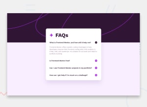
As some sort of challenge, I decided to do the challenge without JS, as a way of practicing with Details Summary.
What challenges did you encounter, and how did you overcome them?I struggled a little bit with customizing the marker for the Details Summary. But reading a couple of posts about it, the work got easier.
What specific areas of your project would you like help with?Overall. Responsiveness, good practices, ways to simplify stuff I did.
Community feedback
- @LeviKuhauluaPosted 6 months ago
Heyo, something that I like to do with writing less CSS (especially media queries) to make your components responsive is to use the
minfunction withmax-width. For example, with card components, you can do something like this.card { max-width: min(500px, 80%) ... other styles }That way at smaller screen sizes, the size will change to be 80% of the screen, and then at larger screen sizes, it will be 500px.
1

Please log in to post a comment
Log in with GitHub
Join our Discord community
Join thousands of Frontend Mentor community members taking the challenges, sharing resources, helping each other, and chatting about all things front-end!
Join our Discord