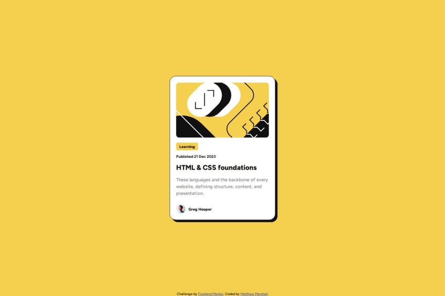
Design comparison
SolutionDesign
Solution retrospective
What are you most proud of, and what would you do differently next time?
I am proud that I was able to get the components looking correct without much issue. Most CSS fields are getting easier to fill out without any resources to allow me to get the look I am trying to get. As a challenge, I think next time, I would try to use flexbox instead.
What challenges did you encounter, and how did you overcome them?I was still getting caught up with getting spacing between sections correct. Also, I was unable to get the main content holder using flex without having items overlapping.
What specific areas of your project would you like help with?I would like to learn best practices for making items more responsive.
Community feedback
Please log in to post a comment
Log in with GitHubJoin our Discord community
Join thousands of Frontend Mentor community members taking the challenges, sharing resources, helping each other, and chatting about all things front-end!
Join our Discord
