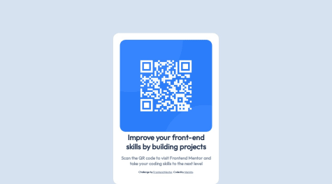
Hey y'all, came back for the summer holiday a few days ago, and i thought i'd learn more things on front end (push myself from being a designer to being a developer) and still practice the ones I already know (that second part's easier now with front-end mentor). Anyway, you'd notice that what I did isn't exactly what's on the desktop design pic (thought I'd play around the color a bit🤷), and I've actully got a question, which is that, when i share the live site link to my phone, everything in the QR Code Component shifts to the right (except that text that's above it though), and the white background doesn't cover the code nor the picture anymore, it's not even there again. So I ask, is this how it's supposed to be on mobiles?🤔 Probably because it wasn't created as a mobile site or something?🤷♂️
Kelf Almeida
@Kelf1729All comments
- @MfrekeeSubmitted over 1 year ago@Kelf1729Posted over 1 year ago
No my friend, next to the readme there is a screen size of 375px for mobile phones and in the images there is an image for mobile design. but don't worry, you can redo the project and adjust it as you improve and study, good studies.
1 - @jasnoludekSubmitted over 1 year ago
I just completed my 5th Frontend Mentor beginner challenge. I am looking for feedback on accessibility, responsiveness and overall best practices. Thank you for looking!
- @MarkitoOffSubmitted over 1 year ago
Hello! This is my first challenge and I would like to have some advice that will allow me to improve even more. I accept any comments.
@Kelf1729Posted over 1 year agoHi, i can't see your code, link doesn't work but you need put in your code: body{ min-height: 100vh; display: flex; justify-content: center; aligh-items: center; } So your qrcode card will be centralized, good work and keep going.
Marked as helpful1 - @pablohimselfSubmitted over 1 year ago
How can I improve my CSS?
@Kelf1729Posted over 1 year agoHi, change it height: 100vh -> min-height: 100vh width: 1440px, take it off, you don't need it.
Marked as helpful0 - @NyayDGSubmitted over 1 year ago
I used flex-box to make the column container. This one was easy and used madia query and flex-box for responsiveness. If you find any problem with my code then please help me improve.
@Kelf1729Posted over 1 year agoHi, there is a problem with mobile, the columnn has a border-radius what its doesn't have in mobile( it is a detail), it's simple to resolve it, nice work.
0 - @freitas-andersonSubmitted over 1 year ago
Avaliem meu desempenho.
@Kelf1729Posted over 1 year agoFicou ótimo cara, acho que você só esqueceu do icone de carrinho de compras do lado do texto do botão mas fora isso ficou ótimo. Uma dúvida, o preço maior verde e o menor em cinza você deixou eles lado a lado nivelado como? usou um display flex nos dois e depois um align-items: center? Parabéns, continue assim.
Marked as helpful0 - @Erick384Submitted over 1 year ago@Kelf1729Posted over 1 year ago
Great work, but you need put padding and change the background color, nice work keep working.
Marked as helpful0


