Not Found
Not Found
Not Found
Not Found
Not Found
Not Found
Not Found
Not Found
Not Found
Not Found
Not Found
Not Found
Not Found
Not Found
Not Found
Not Found
Not Found
Not Found
Not Found
Not Found

Submitted

QR code component desktop design

@Mfrekee

Desktop design screenshot for the QR code component coding challenge

This is a solution for...

  • HTML
  • CSS
1newbie
View challenge

Design comparison


SolutionDesign

Solution retrospective


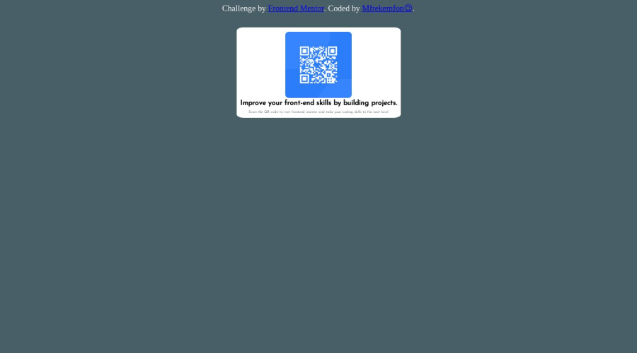
Hey y'all, came back for the summer holiday a few days ago, and i thought i'd learn more things on front end (push myself from being a designer to being a developer) and still practice the ones I already know (that second part's easier now with front-end mentor). Anyway, you'd notice that what I did isn't exactly what's on the desktop design pic (thought I'd play around the color a bit🤷), and I've actully got a question, which is that, when i share the live site link to my phone, everything in the QR Code Component shifts to the right (except that text that's above it though), and the white background doesn't cover the code nor the picture anymore, it's not even there again. So I ask, is this how it's supposed to be on mobiles?🤔 Probably because it wasn't created as a mobile site or something?🤷‍♂️

Community feedback

@koeno100

Posted

Good first try on this challenge! You've got the visual layout right and I get what you're trying to do. There are a few serious problems to address here, which luckily will clean up your design significantly when fixed:

  1. What is the resolution of the screen you created this on? I'm on a screen that's 1920px wide and the solution looks very weirdly stretched on my screen (see the screenshot in the design comparison at the top of this page). To keep the width under control, I recommend you open the example image in a photo editor like paint or photoshop and measure the width of the main panel. Then, when you have found the width of the card, you can specify using the width property in CSS.
  2. The reason your text shifts to the right is because of your margin: 51px 400px; line in the .vid selector. Since the first change I mentioned will keep the width under control, it's not necessary anymore to have such margins. If you want to center the card, regardless of the screen resolution, use margin: 51px auto instead. This will automatically center the card horizontally.
  3. Be aware how padding and margin affect elements differently. padding affects the space within the border, while margin affects the space outside of the border. This means that the padding-top: 8px property within your .pic selector will add 8 pixels to the top of the bouding box of the image within the border. Since the dimensions of the image are fixed, the image itself stays unaffected, but the top border will shift 8 pixels up (which is 8 px of invisible space since there's no background color or anything else within this element), thus the top corners of the image will look different than the bottom corners.
  4. Did you have a look at the style-guide.md? There it specifies the used colours, fonts and font-sizes. For instance, the font-size of <p> should be 15px according to the style guide, and it has given you all the colours used in the design for the background etc.
  5. Your HTML needs some adjustments when it comes to accessibility. Instead of <div>, try use appropriate semantic HTML tags: reference.
  • For example, <div class="small"> could perhaps be replaced by <header> since it's heading the page, while <div class="vid"> could be replaced by <main> as it's the main content of the page.
  • You used <strong> incorrectly. This element is intended for content that has importance or urgency within the bigger context. Instead, the text is a header, so it's more appropriate to use one of <h1> to <h6> headers.
  • Avoid using id unless it really is a unique element.
  • I would also recommend to use more specific class names. Classes like "small," "vid" and "pic" are easy to track in a small challenge like this, but once you get to making bigger projects, it's easy to lose overview if you're not being specific with your class names. I believe it's better to teach yourself these habits early on instead of having to readjust later on.
  • Block elements like <div> and <p> automatically start on a new line, so <br> is not necessary before or after these elements. Here is an overview of block-level and inline elements.
  1. Instead of using px in your CSS, use rem instead. px is absolute and can make your page unreadable for some people. Browser have a setting to have the default font size changed, which is by default 16px. However, if someone needs default font size set to 32px to be able to understand the page, then the layout of the page won't change along when using px. rem adjusts based on whatever font size the browser or <html> tag is set to. Thus, if the user sets their default font size to 18px, then 1rem = 18px. However, when the user sets the font size to 32px, then 1rem = 32px. By making your designs proportionally in rem, this ensures that the whole design still works when the font size is changed. Assuming that you code everything with a browser default font size of 16px, you can convert all your px values to rem values by dividing them by 16. Someone here referred me to this article earlier if you want to know more about the different units!

It's a lot of information, but I think if you tackle these points first, you'll get a much cleaner code with more control over the design and a cleaner looking design! If you have any questions, feel free to ask! :)

Marked as helpful

2

@samuerikcoder

Posted

Hello friend, I took a look at your site and did some testing while inspecting the element in the browser. Whenever you develop something on the frontend try to start with the mobile version, we call it mobile first. One of the things I did to improve its design was

body  { 
display: grid; 
place-content: center; 
min-height: 100dvh
}

Create an element that will help you create the text part, a div with the 'text' class or whatever you think is best.

This video on YouTube saved me when I wanted to start making the challennges on this site: https://youtu.be/B2WL6KkqhLQ

I haven't started this challenge yet, if it wouldn't give you better support on the issues, but feel free to see my other solutions.

Marked as helpful

2
T
Josh 400

@burrijw

Posted

Hi! Welcome to Frontend Mentor. You're off to a good start, but there's a lot that can be improved.

HTML

  • Include a <main> element on every page that you make. Landmarks are an important part of semantic HTML and help a lot with accessibility. Check out this MDN page
  • The structure of this component (and challenge overall) is quite simple. And you want to keep your HTML as simple as possible to improve performance and accessibility. All you really need is this:
<body>
<main>
<img>
<h1></h1>
<p></p>
</main>
<footer>
...
</footer>
</body>
  • You've used a <strong> tag where you should probably use a heading. Avoid using <strong> and similar tags based on the visual state of something. Think more about the semantic meaning instead.

CSS

  • Generally, you should be working mobile-first and adding overrides as the screen gets bigger. But this challenge doesn't require anything like that. It's the same at all screens.
  • Don't set font sizing in px, use rem instead.
  • It's hard to read the attribution. Change the text color to something with contrast against that background color.
  • Try using rem for your border radius values.

Make some changes and submit this one again! Refactoring is where the real learning happens. And come join us on Discord if you haven't already!

Marked as helpful

1

@Kelf1729

Posted

No my friend, next to the readme there is a screen size of 375px for mobile phones and in the images there is an image for mobile design. but don't worry, you can redo the project and adjust it as you improve and study, good studies.

1

Please log in to post a comment

Log in with GitHub
Discord logo

Join our Discord community

Join thousands of Frontend Mentor community members taking the challenges, sharing resources, helping each other, and chatting about all things front-end!

Join our Discord