Kasra Tabrizi
@KasraTabriziAll comments
- @Lara123-pgSubmitted about 3 years ago@KasraTabriziPosted about 3 years ago
I like how you structured your files for this project.
The only small improvement you can make is to try to center your container. Other than that, good job!
Marked as helpful0 - @catherineisonlineSubmitted about 3 years ago@KasraTabriziPosted about 3 years ago
I was also having issues positioning the images in desktop mode, so you are not the only one lol. Especially with the small box and the pattern image.
But it looks good otherwise!
0 - @KasraTabriziSubmitted about 3 years ago@KasraTabriziPosted about 3 years ago
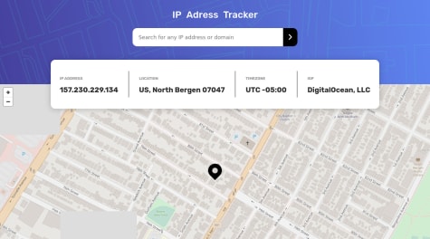
Does anyone happen to know why my screenshot doesn't match with the assignment screenshot? I have a pixel-perfect design on my laptop screen, but it doesn't look that way on the screenshot. It seems to me that frontendmentors takes a screenshot with a certain viewport
0 - @bodashideungSubmitted about 3 years ago@KasraTabriziPosted about 3 years ago
I would adjust the spacing a little bit to make it pixel perfect, but other than that, it looks very good!
0 - @catherineisonlineSubmitted about 3 years ago@KasraTabriziPosted about 3 years ago
Nice job! I would give a box-shadow to the button and make the input element have a white background color. Other then that, looks great!
0 - @kennbachSubmitted about 3 years ago
- @catherineisonlineSubmitted about 3 years ago@KasraTabriziPosted about 3 years ago
Nice job!
Only one issue: The map and info doesn't change when searching for a different IP address. It always shows the default one from Georgia.
0 - @kennbachSubmitted about 3 years ago@KasraTabriziPosted about 3 years ago
It looks pretty good! There is only a slight difference in the image. The original design has a blue-ish overlay on the image.
0 - @HolllyyyySubmitted about 3 years ago@KasraTabriziPosted about 3 years ago
It looks pretty good! I would only look for adding a shadow-box and adding some font weight to the text.
Marked as helpful0 - @catherineisonlineSubmitted about 3 years ago@KasraTabriziPosted about 3 years ago
Very well done! I only see a slight difference in font weight but other than that I would say it is pixel perfect!
Marked as helpful1 - @kennbachSubmitted about 3 years ago@KasraTabriziPosted about 3 years ago
Hi Ken Bach,
It looks really good! If you also add some box shadow to this, it will look perfect!
Marked as helpful1 - @Prajwol-ShresthaSubmitted about 3 years ago@KasraTabriziPosted about 3 years ago
Nice job!
Two minor things:
- I would use a lighter box shadow.
- The title of the box should have a bigger font size.
Other than that, keep up the good work!
Marked as helpful1 - @byronbyronSubmitted about 3 years ago@KasraTabriziPosted about 3 years ago
In terms of design and responsiveness, everything looks good!
For the functional side, I would also look for adding a way to search for domain name because that is also mentioned in the input placeholder.
Also great job making this with Svelte!
0 - @KasraTabriziSubmitted about 3 years ago@KasraTabriziPosted about 3 years ago
I also would like to mention that the block below the search bar where the additional info is displayed, is not visible when you visit the page because it will fade in when you do your first search (hence why you don't see it in the screenshot).
0


