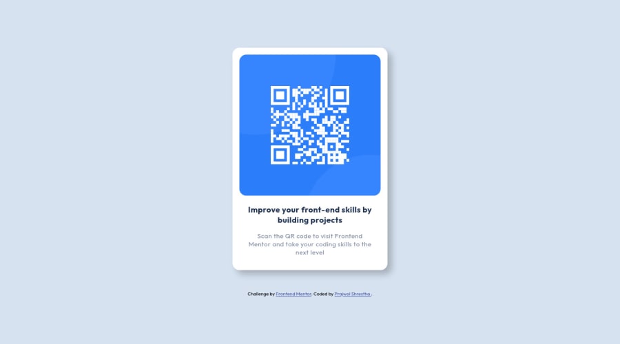
Submitted about 3 years ago
Frontend Mentor - QR code component solution
@Prajwol-Shrestha
Design comparison
SolutionDesign
Solution retrospective
Any Feedback is really appreciated.
Community feedback
- @KasraTabriziPosted about 3 years ago
Nice job!
Two minor things:
- I would use a lighter box shadow.
- The title of the box should have a bigger font size.
Other than that, keep up the good work!
Marked as helpful1 - Account deleted
Hello there! 👋
Congratulations on finishing your challenge! 🎉
I have some feedback on this solution:
- Always Use Semantic HTML instead of
divlike<main><header>, etc for more info.
if my solution has helped you do not forget to mark this as helpful!
Marked as helpful1 - Always Use Semantic HTML instead of
Please log in to post a comment
Log in with GitHubJoin our Discord community
Join thousands of Frontend Mentor community members taking the challenges, sharing resources, helping each other, and chatting about all things front-end!
Join our Discord
