Skip to content
Learning paths
Challenges
Solutions
Articles
Unlock Pro
Log in with GitHub
Profile
Overview
Solutions
7
Comments
1
Juan Esteban Camargo
@Juanescacha
Follow
All solutions
Submitted 12 months ago
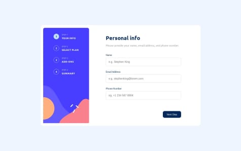
Responsive - Multi Step Form (Desktop, Mobile)
HTML
CSS
JS
0
5
0
Submitted about 1 year ago
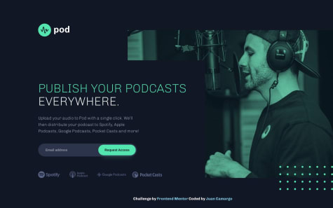
Responsive - Pod Request Access (Desktop, Tablet, Mobile)
HTML
CSS
JS
1
3
0
Submitted about 1 year ago
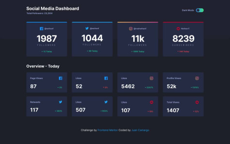
Responsive with Dark Mode - Social Media Dashboard (Desktop, Mobile)
HTML
CSS
JS
0
7
0
Submitted about 1 year ago
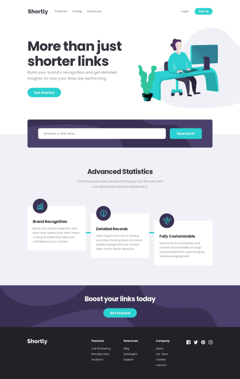
Responsive - Url Shortening Api (Desktop, Mobile)
HTML
CSS
JS
API
0
1
0
Submitted about 1 year ago
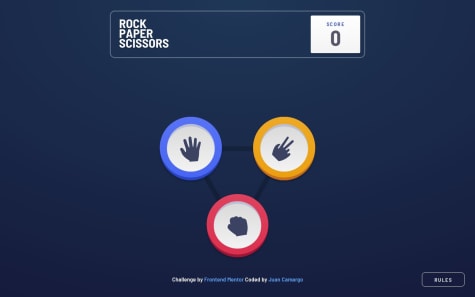
Responsive - Rock Paper and Scissors (Desktop, Mobile)
HTML
CSS
JS
0
6
0
Submitted about 1 year ago
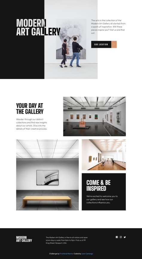
Responsive - Art Gallery Website (Desktop, Tablet, Mobile)
HTML
CSS
0
4
1
Submitted about 1 year ago
Responsive - Pod Request Access (Desktop, Tablet, Mobile)
HTML
CSS
JS
1
4
0
