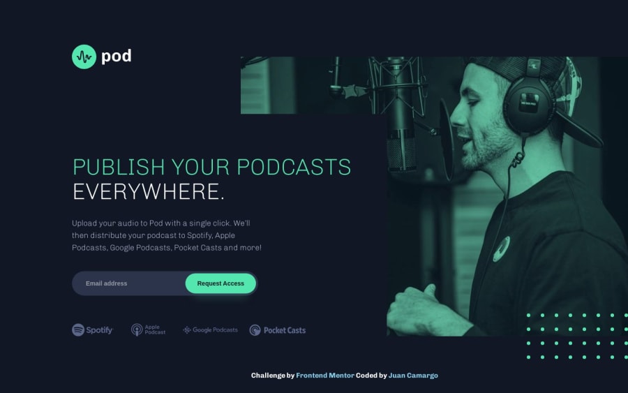
Responsive - Pod Request Access (Desktop, Tablet, Mobile)
Design comparison
Solution retrospective
This challenge represents a new solution proposed as an improvement to the corrections mentioned in my initial attempt by @jairovg. I focused on enhancing accessibility (A11Y) and conducted audit using the ChromeVox extension to observe how a Screen Reader navigates through the page. Additionally, I performed an audit using the Lighthouse tool to assess both accessibility and DOM semantics.
I modularized the application's components and defined their styles in each Single File Component (SFC) to ensure easy reusability. I applied the BEM methodology and utilized SCSS for enhanced synergy.
I would appreciate feedback on this solution. If there are opportunities for improvement or if there are better practices that can be employed, please let me know!
Community feedback
- @edward-montoyaPosted about 1 year ago
Nice job. I see you have implemented all the Jairo's suggestions. Now, looks better and more organized.
Suggestions
- I don't like the h1 divided in two pieces, probably the screen readers are smart enough to share with the user the right name. However, I prefer a "hidden" solution to separate the title from the h1 (optional).
- The modifiers of the streaming companies are defined in a wrong way. Since, you are using BEM as class naming methodology, you are using the syntax
main__item-google, however, the correct syntax ismain__item--google. - Instead of using
aria-hiddenin the images, I think, it is more clear if you just usealt="". Both options tell the screen readers that the image is decorative.
Marked as helpful1@JuanescachaPosted about 1 year ago@NicolasMontoya Thank you for the feedback; I'll take a look at what you mentioned 👍
0
Please log in to post a comment
Log in with GitHubJoin our Discord community
Join thousands of Frontend Mentor community members taking the challenges, sharing resources, helping each other, and chatting about all things front-end!
Join our Discord
