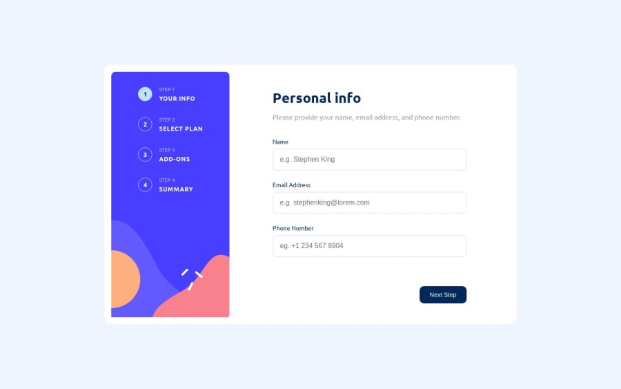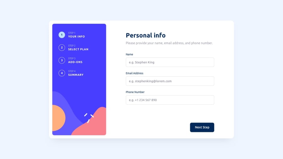
Responsive - Multi Step Form (Desktop, Mobile)
Design comparison
Solution retrospective
- ✅ Responsive: Desktop and Mobile
- ✅ Form Validation
- ✅ Steps form
- ✅ A11y
- ➖ Unit tests (soon..)
- ➖ Dark Mode (soon..)
This challenge, from the moment I saw it, seemed very interesting to me, and I really liked the design of how navigation is handled throughout this multi-step form. Superficially, it looks simple, but it took a little more time than expected. I focused on correctly validating the fields and ensuring smooth navigation, applying best practices for accessibility (which I am learning). I also used BEM naming conventions for CSS classes to have a better workflow in creating responsive views. I started, as always, with a mobile-first approach.
I would appreciate it if you could review it and let me know if there are any corrections/improvements or any processes that would make a difference. Your feedback is valuable for improvement!
Community feedback
Please log in to post a comment
Log in with GitHubJoin our Discord community
Join thousands of Frontend Mentor community members taking the challenges, sharing resources, helping each other, and chatting about all things front-end!
Join our Discord
