Ineke
@Ineke84All solutions
- Submitted about 1 month ago
Social links profile
- HTML
- CSS
I don't have any specific questions, but any suggestions to improving my solution are very welcome.
- Submitted 3 months ago
Blogpost preview with clamp and flex-box
- HTML
- CSS
I would love to hear if there's another/better solution for the positioning of de blogpreview and the attribution at the bottom. I want the card vertically centered in the middle and the attribution at the bottom of the screen as longs as this would fit. If the blogpreview gets to big with a narrower screen only then the attribution should move further down so you would need to scroll down to see it just below the card. At the moment I fixed it with flexbox and height with clamp(). But I'm not really sure about it.
Any other feedback is also very welcome.
- Submitted 7 months ago
Recipe page using css and html
- HTML
- CSS
- Use of semantic html
- My solution of the header image
Any other feedback is also appreciated.
- Submitted about 2 years ago
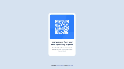
QR component using html and css
- HTML
- CSS
I completed this challenge quite some time before learningpaths, I already got some feedback.