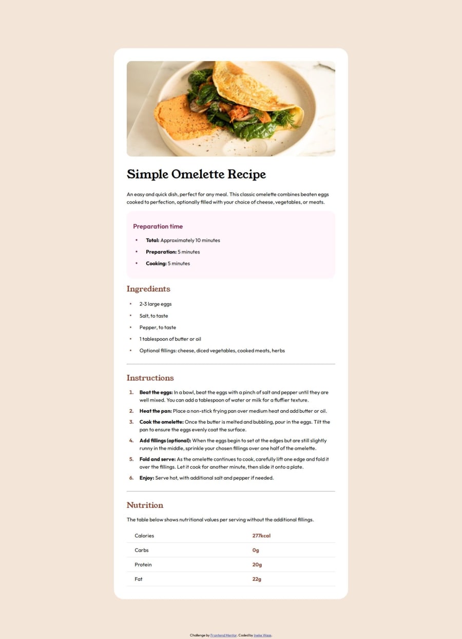
Design comparison
SolutionDesign
Solution retrospective
What are you most proud of, and what would you do differently next time?
I'm proud that I recreated the image very closely. Next time however I should start with mobile first. I know I should and rewrote my code, but did start with desktop.
What challenges did you encounter, and how did you overcome them?- The heading image
- Vertically centering the list items marker
- Structuring my html with semantic html
- Use of semantic html
- My solution of the header image
Any other feedback is also appreciated.
Community feedback
Please log in to post a comment
Log in with GitHubJoin our Discord community
Join thousands of Frontend Mentor community members taking the challenges, sharing resources, helping each other, and chatting about all things front-end!
Join our Discord
