


@CHarvey820
Latest solutions
Countries Finder (Nextjs + TypeScript +Tailwind)
#next#tailwind-css#typescript#axiosSubmitted about 2 years agoAge Calculator (React Vite + Tailwind + TypeScript)
#react#tailwind-css#typescript#vite#redux-toolkitSubmitted about 2 years agoSneakers Ecommerce Website
#express#mongodb#react#tailwind-css#redux-toolkitSubmitted over 2 years agoAdvice generator app (React + Tailwind)
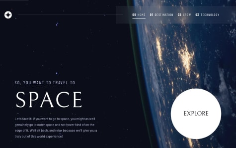
#accessibility#react#tailwind-css#fetchSubmitted about 3 years agoSpace Tourism multi-page website (using React, tailwind and sass)
#accessibility#react#react-router#sass/scss#tailwind-cssSubmitted over 3 years ago
Latest comments
- @Hikmahx
Hi CHarvey 👋! You did excellent work on this project! I have a suggestion for you:
For the
boxclass, it would be better if the width is set to 100% rather than a fixed 450px. This is because when an element has a max-width property, the width becomes responsive on smaller devices and stops increasing beyond that specific max-width.I hope this helps
Marked as helpful - @LipeCat@Hikmahx
Hi Lipe 👋! I checked your solution and you did great work on this project! I have a few suggestions for you:
- You should add a padding of 1rem to the body of your application:
body {
    padding: 1rem;
}
This is so that on smaller screen sizes, the QR code container can have some spacing around it.
Hope this helps
Marked as helpful - @sirgra@Hikmahx
Hi sirgra 👋! I checked your solution and you did great work on this project! I have a few suggestions for you:
- Since it is a single component, the card should be centered and the page should be the size of the device. This means the project should simply occupy the whole height.
To do this, replace the margin in the
parent-containerwithmargin: autoand remove the media query becausemargin: autois all you'd need. This will make the card centered. - To the body of the code, add this:
body {
    height: 100vh;
    display: flex;
    flex-direction: column;
}
The
height: 100vh;will make the height of the page the full height of the device, making it a full page. usingdisplay: flex;will shift the card to the center vertically and since by default, the file direction is row, ie the element in the body will be arranged in the horizontal row, addingflex-direction: columnmakes the card and attribution to be organized in a vertical way.Hope this helps
Marked as helpful - Since it is a single component, the card should be centered and the page should be the size of the device. This means the project should simply occupy the whole height.
To do this, replace the margin in the
- @ubonisrael@Hikmahx
Hi @ubonisrael 👋! I check your website and you did a great job with this solution. The pages are highly responsive and everything looks good.
I noticed that you could enhance the user experience by adding a few transitions to the slider and tabs. For instance, you could consider adding a fade-in effect when a new tab is clicked while the former fades out. This would make the browsing experience smoother and more enjoyable for your users.
Marked as helpful - @Mehar45@Hikmahx
HI Safi 👋! Great job!
I tried viewing the code on your GitHub so I can give you a suggestion but I couldn't find the JavaScript. I wanted to rewrite the code based on how you write yours.
This is just a simple suggestion, something you may use.
So for the border countries, if you want to get the full country name instead of the abbreviation, you can fetch the border countries inside the function you use to get a single country detail.
async (name) => {
    try {
      let { data } = await axios.get(
        `https://restcountries.com/v3.1/name/${name}?fullText=true`
      );
      const country = await data;

       // CODE IS HERE
      const borders = await data[0].borders;
      if (borders) {
        let borderDetails = await axios.get(
          `https://restcountries.com/v3.1/alpha?codes=${borders.join(",")}`
        );

        let allBorders = await borderDetails.data.map(
          (border: any) => border.name.common
        );

        return { country, allBorders };
      }
      return { country };

      // return allBorders;
    } catch (err) {
      return err
    }
Hope this helps
Marked as helpful - @Mirage9898@Hikmahx
Hi @Mirage9898 👋. Nice work! I have a few suggestions for your solution:
- I think adding a margin to the container, like
margin: 16px;, will be better for mobile view, to add a bit of spacing around the container. - For the two images, icon-ethereum.svg and icon-clock.svg, not to give a stretched appearance, adding
object-fit: contain;will allow these images to retain their shapes.
Hope this helps
- I think adding a margin to the container, like