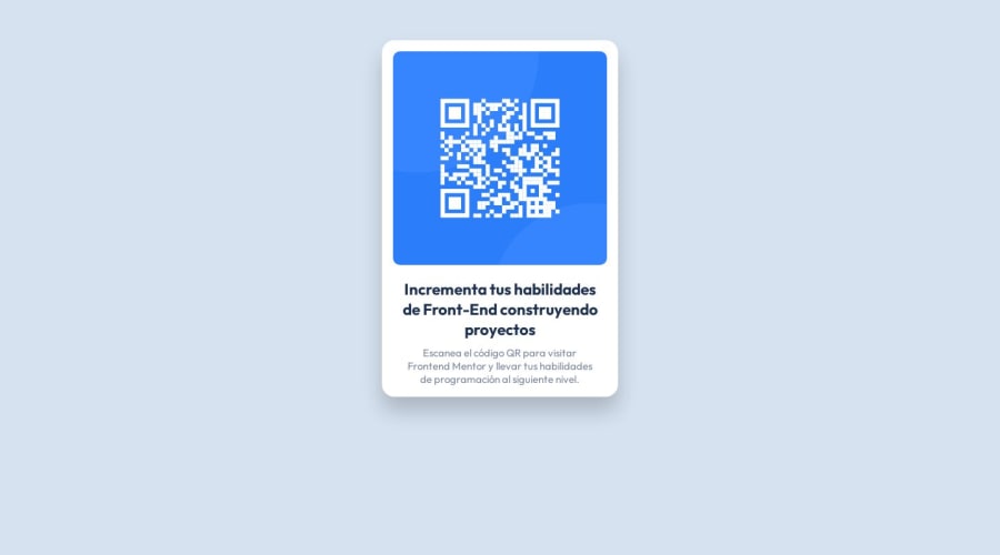
Design comparison
Solution retrospective
This is my solution. Is there anything I can improve?
Thanks for your feedback
Community feedback
- @HikmahxPosted over 1 year ago
Hi Lipe 👋! I checked your solution and you did great work on this project! I have a few suggestions for you:
- You should add a padding of 1rem to the body of your application:
body {
    padding: 1rem;
}
This is so that on smaller screen sizes, the QR code container can have some spacing around it.
Hope this helps
Marked as helpful0@LipeCatPosted over 1 year agoHello @Hikmahx ! I really appreciate your advice, thank you very much. I will add it.
0 - @Zy8712Posted over 1 year ago
Your site looks pretty good. Main things I'd say you should add/modify is:
- using a
<main>tag to wrap around your content, this is for accessibility purposes - set body height to
height: 100vh;this will keep your container perfectly centered - use a
<h1>header instead of a<h2>header as headers are meant to be used in order from h1 to h6 with skips. Each header has a default starting font size that can be changed using thefont-sizeproperty in css.
Hope you find this useful 👍
Marked as helpful0@LipeCatPosted over 1 year agoHi @Zy8712 ! I really appreciate your advices, thank you very much.
I forgot that detail. Do I replace the <main> tag with the containing <div> tag or add it as the parent tag of all content?
Once again, thanks for your feedback and time.
0 - using a
Please log in to post a comment
Log in with GitHubJoin our Discord community
Join thousands of Frontend Mentor community members taking the challenges, sharing resources, helping each other, and chatting about all things front-end!
Join our Discord
