Not Found
Not Found
Not Found
Not Found
Not Found
Not Found
Not Found
Not Found
Not Found
Not Found
Not Found
Not Found
Not Found
Not Found
Not Found
Not Found
Not Found
Not Found
Not Found
Not Found

All solutions

  • Submitted


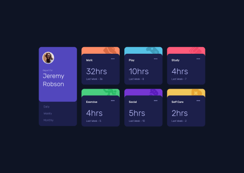
    I made this project using constructor functions, something I had never used before, so I had to look them up and watch some tutorials, but I think it was worth it, because now I have some knowledge about key components of JS such as constructors, classes and .this keyword. I started to work on this project with a bunch of if statements and innertexts, but I stopped mid project as some features were weird to implement in this format, and that's the reason I looked up at other ways of doing it. Worth it overall! For the theme changing part it wasn't difficult at all, just a bit of a mess with all the classes to add to the css file in order to change the theme.

  • Submitted


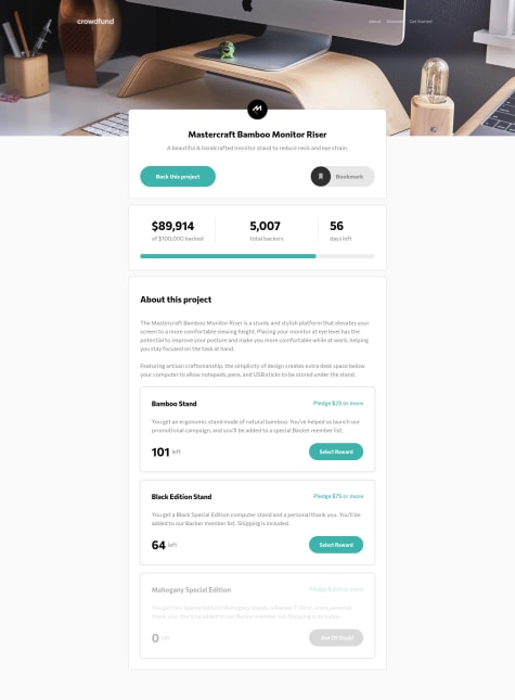
    Oof, that was an hard one! I worked on the html/css part for 2 days, no problems of any kind (except maybe the shadow from the top and the bookmark button imperfect color change, but the first one should be an issue of my body setup and I didn't want to go back). I just don't have lots of experience with projects these big, so I wasted some time with some futile details. Also I didn't find many issues with the javascript part, which was definitely shorter than the other part. Not the cleanest code, probably one of the messiest to be honest, but I'll get there I believe, I'm just starting out and I'm sure my code will be cleaner with more experience. Any feedbacks and tips are always appreciated!

  • Submitted


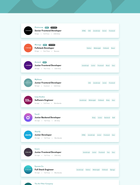
    My first lvl 2 project on Frontend Mentor! I have been studying Javascript for the last month, and after some little projects here and there I decided to try my skill in these projects. It wasn't easy at first, there were some new challenges, such as fetching data from a JSON file, and also a parameter problem on my function, basically if I used the parameter in dot notation to go deep in an object it would bug out, so I had to use bracket notation. Yes, I know, pretty novice stuff, but I always used dot notation, so I totally forgot the bracket one. The js coding part seems clean to me, I tried to use less code as possible, I could've solved the javascript portion like 10x faster if I wanted to write a lot of code, but that's not how it's supposed to go, so I forced myself to write as l little code as possible, and I'm pretty happy with the result! I know my code is probably still on the bad side, but I'm sure that the more I code, the better I'll become, and I cannot wait to start a new project! Any feedback is always appreciated, have a nice day!

  • Submitted


    Hello! This is definitely my worst attempt at a challenge, I don't really know what happened to be honest, it was a mix of frustration about box sizes, background image not showing and responsiveness adjusts. It turned out in the end, but the code is messy and I even gave up giving the proper blend mode to the image (I could've probably sorted that out, but I was really done with it). May I ask you how do you work with projects like this, where the target resolution is 1440p, but you have a 1080p monitor? How do you "simulate" the differences while coding? I can see that my proportions are right, but I'm on a different resolution device so how can I know what the difference will be on 2K? I saw a video about the "clamp" element, I will try to use it in the next responsive challenge, what do you think of it? Is it helpfull? Thanks for reading and happy coding!

  • Submitted


    Third challenge after 10 days of studying HTML and CSS! Not too much to say, it was a fairly easy challenge, even though I had some issues with anchor tags, but that was probably my fault as I was quite tired. The code is larger than what I expected it to be, probably still because I was a bit tired and I 100% made some mistakes with classes and proprieties. Any feedback is always appreciated, have a nice day!

  • Submitted


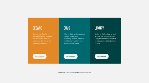
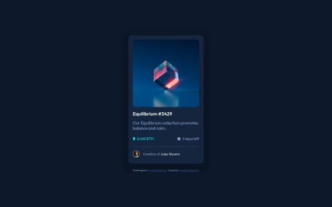
    My second challenge after ~ten days of HTML and CSS, sorry if the code is badly structured/disorganized, I'm definitely going to step up my code layout in the next challenges that I'll do. In this challenge I focused on learning more of Flexbox, as it is quite necessary in this type of card-like styles, and I also started messing with pseudo elements, ::before and ::after in this specific case. It was a really nice challenge overall, got a few headaches with some parts, especially pseudo elements and the overall centering and alignment of the various parts of the card, but I think I learned a lot from it, so it's all good. Any feedback is appreciated, thanks for reading!

  • Submitted


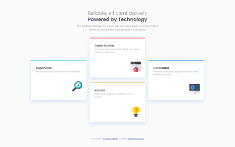
    Hello! This is my first project after one week of learning html and css, and it's been a blast so far! I learned a lot thanks to this challenge, especially some neat grid related stuff and responsive tricks to adjust the site accordingly to a device's screen size. I really liked the challenge overall and I suggest it to other html and css beginners, it is amazing! Some of the stuff I found hard to achieve: correct grid setup, grid centering. Two things I know are incorrect: I have put the icons at the end of the box using margins, but this causes a problem regarding their position in relation to the description: if the description is one line long, the icon is shown higher in the box; if the description is two lines long, the icon is shown lower. I know there is some kind of fix to this, probably I shouldn't have used margins but something else. The other incorrect thing is the height of the page. I would've liked the page to not be scrollable, and instead be just a single page, but probably I got my sizes wrong and the page is now scrollable. I could've fixed it readjusting all the sizes, but I couldn't be bothered. Is there something easier to fix this issue? Thanks for your time!