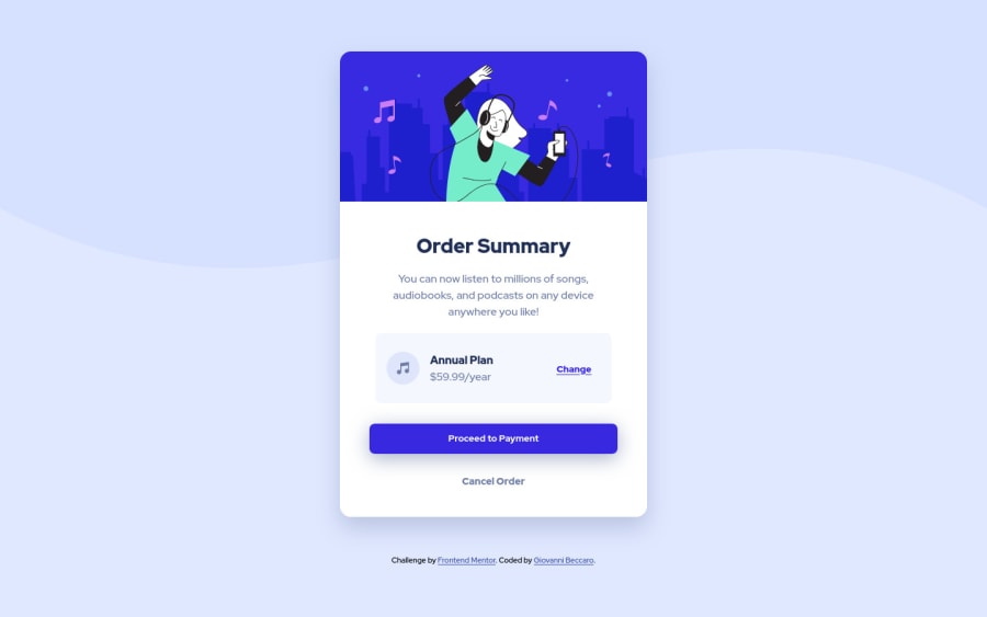
Order summary component challenge with Flexbox and mobile layout


Design comparison

Solution retrospective
Third challenge after 10 days of studying HTML and CSS! Not too much to say, it was a fairly easy challenge, even though I had some issues with anchor tags, but that was probably my fault as I was quite tired. The code is larger than what I expected it to be, probably still because I was a bit tired and I 100% made some mistakes with classes and proprieties. Any feedback is always appreciated, have a nice day!
Community feedback
- @brodiewebdtPosted almost 3 years ago
I think this looks great. Except for the slight difference in alignment in the comparison window it look spot on. Wrap the card section in a main tag and change the Order Summary to an H1 and it will clear the accessibility warnings. You may have to restyle the Order Summary text when doing that. Hope this helps.
Marked as helpful1@GioltekPosted almost 3 years agoThanks for the feedback @brodiewebdt ! Yeah, I noticed the difference in alignment too, it's probably caused by the attribution at the end. I just removed the attribution even though it was fixable without deleting it, now it should look better on the side by side, even though it isn't updating for some reason. Thanks for the tip about the h1, I was pretty sure I made it an h1, but it was a paragraph indeed ahah! Also it seems like h2-h6 are the problem by the html report, but whatever, I won't update the github again, also an h2 isn't really needed in a card like that so that's alright.
0 - @brodiewebdtPosted almost 3 years ago
The report was because their was no Heading tag at all. Those reports aren't very clear. Download AXE DevTools and use it while you are coding to help clear up accessibility issues. https://www.deque.com/axe/devtools/
0

Please log in to post a comment
Log in with GitHubJoin our Discord community
Join thousands of Frontend Mentor community members taking the challenges, sharing resources, helping each other, and chatting about all things front-end!
Join our Discord