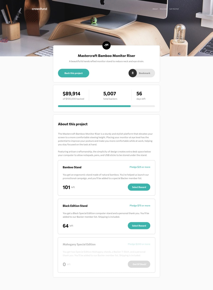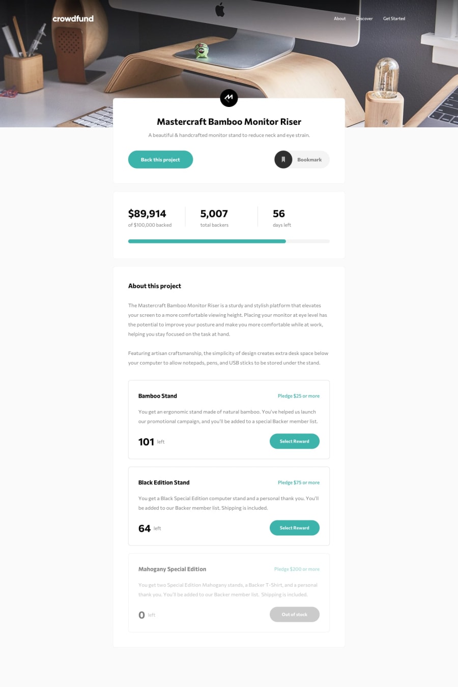
Responsive page desktop first, multiple modals, reactive buttons.
Design comparison
Solution retrospective
Oof, that was an hard one! I worked on the html/css part for 2 days, no problems of any kind (except maybe the shadow from the top and the bookmark button imperfect color change, but the first one should be an issue of my body setup and I didn't want to go back). I just don't have lots of experience with projects these big, so I wasted some time with some futile details. Also I didn't find many issues with the javascript part, which was definitely shorter than the other part. Not the cleanest code, probably one of the messiest to be honest, but I'll get there I believe, I'm just starting out and I'm sure my code will be cleaner with more experience. Any feedbacks and tips are always appreciated!
Community feedback
- @bilalahmed-dev0Posted almost 3 years ago
hey am doing the same project , an am a bit stuck on javascript , if we could communicate on any social media platform , so that you can help me.
0
Please log in to post a comment
Log in with GitHubJoin our Discord community
Join thousands of Frontend Mentor community members taking the challenges, sharing resources, helping each other, and chatting about all things front-end!
Join our Discord
