HI @edwinc73, congrats on completing this challenge. Your code's really clean and readable.
I'll just point out that the pseudo-elements you used need to be managed better as they are showing up beside your inputs in mobile screens.
Hi @Towbee05, congrats on completing this challenge. I enjoy your use of code as always.
I just noticed that some of your input fields do not have a placeholder. There were also no hover and focus states for the buttons. That being said, job well done.
@Towbee05, congrats on completing this challenge. Fantastic job. Really enjoyed your use of code.
I noticed that you didn't pay attention to the hover states. I also noticed that you modified the data.json. When working with APIs, you normally can't modify such. So you can learn how to consume the data given and use them just the way they are presented. All that being said. Job well done.
Hi @MrSeager, congrats on completing this challenge.
My only advice is for you to try to use more semantic html so that your code can be more readable. Also try to use classnames that have better context.
Happy coding!
Hello @GerryL2. Great work on this project.
Your solution doesn't really match the design on mobile devices. You can check for the window.innerWidth to run a new function that'll toggle the classes on and off when it is less than the desired window.innerWidth. This can help you achieve the similarity to the design.
Hello @OsatohanmwenT, congrats on completing this challenge. Here are some tips to make your code better.
To center your container, you can simply make use of flexbox on its direct parent which in your case will be the wrapper. Your code will look like so: .wrapper { display: flex; justify-content: center; align-items: center; min-height: 100vh; padding: 5rem 2rem; // Add padding on its direct parent to avoid your container from touching the top, bottom, and sides of the screen for mobile view. }
Avoid using definite values such as 250px for width or height. Instead, make use of percentages, this makes responsiveness possible.
Hello @Desireye!!, congrats on completing this challenege.
To solve your hover issue, simply get rid of your z-index on both the footer and the in-between card. The z-index prevents the hover effect from taking effect.
Here are some other tips to make your code efficient.
Try to avoid using definite heights and widths on your containers or divs. It makes the very rigid and unresponsive. Percentages are still acceptable.
Direct usage of the button tag obstructs accessibility. Simply use an anchor tag and then style it as a button and try to use more classes on your divs for better specificity or just focus on semantic html.
Hello Anthony!!, congrats on completing this challenge. Here are some tips to make your code better.
To center your card horizontally and vertically, you need to wrap all your contents in a container, preferrably a div with the class name card or whatever works for you. You can then simply make use of flexbox on it's direct parent which in your case will be the <body>. Your code will look like so:
body { display: flex; justify-content: center; align-items: center; min-height: 100vh; // This will make your card sit in the middle of your viewport without vertical scrolling. padding: 3rem 2rem; // Add padding on it's direct parent to avoid your container from touching the top, bottom and sides of the screen for mobile view. }
Your card should equally contain two divs: one for the image and another for the text i.e card-image and card-text respectively. You can then use flexbox to arrange them like so:
.card { display: flex; flex-direction: column; }
Try to add classes as much as possible. The specificity will make your life easier as a frontend developer.
Developers seldom use tags like strong. Make use of the header tags like <h1>, <h2> and the likes and add appropriate font-size and font-weights with their colors. Your code must contain at least one of these in the right order.
Always apply this reset for images:
img { display: block; max-width: 100%; }
This will keep your image inside its container at full width. Look up other css resets and apply them. Here's one: css resets
Please pay attention to the accessibility and validation reports on frontend mentor.
Hello Aziz!!, congrats on completing this challenge. Here are some tips to make your code better.
To center your container, you can simply make use of flexbox on it's direct parent which in your case will be the <main>. Your code will look like so:
main { display: flex; justify-content: center; align-items: center; min-height: 100vh; padding: 5rem 2rem; // Add padding on it's direct parent to avoid your container from touching the top, bottom and sides of the screen for mobile view. }
Try to add classes as much as possible. The specificity will make your life easier as a frontend developer.
If you're making use of a main tag for the purpose of semantics, you should close off your attribution with a landmark like a footer.
Always apply this reset for images:
img { display: block; max-width: 100%; }
This will keep your image inside its container at full width. Look up other css resets and apply them. Here's one: css resets
Please pay attention to the accessibility and validation reports on frontend mentor.
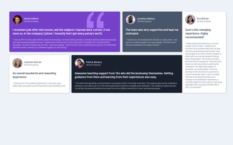
Hello RAFA-OL-DEV!!, congrats on completing this challenge. Your code could be a lot shorter and effective if you try using the grid layout. I realized you named most of your divs "grid-item" but didn't apply the grid layout. To do so, simply use the mobile-first workflow and then add give these properties to the container of whatever class you choose like so:
.grid { display: grid; gap: 1.5rem; grid-template-areas: "first" "second" "third" "fourth" "fifth"; grid-auto-columns: 1fr; // This is to make sure that additional columns take up exactly the same size. }
Then for media queries @media (min-width: ****em) { grid-template-areas: "first first second fifth" "third fourth fourth fifth"; } // Grid-template-areas is a powerful layout system for layouts such as these.
Simply give the cards the grid area and position you want them to take, like so:
.first { grid-area: first; }
For your svg image issue, simply use a background property on it's container, like so:
.class { background-color: color; background-image: url(../images/bg-pattern-quotation.svg); background-repeat: no-repeat; background-position: top right 10%; // This will make sure your svg doesn't go beyond 10% of the container from the right. }
I hope you find this helpful. Happy coding.
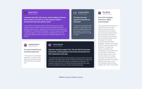
Hello LUIEITALIAN!!, congrats on completing this challenge. Your code could be a lot shorter and effective if you try using the grid layout. Simply use the mobile-first workflow and then add give these properties to the container of whatever class you choose like so:
.grid { display: grid; gap: 1.5rem; grid-template-areas: "first" "second" "third" "fourth" "fifth"; grid-auto-columns: 1fr; // This is to make sure that additional columns take up exactly the same size. }
Then for media queries
@media (min-width: ****em) { grid-template-areas: "first first second fifth" "third fourth fourth fifth"; } // Grid-template-areas is a powerful layout system for layouts such as these.
Simply give the cards the grid area and position you want them to take, like so:
.first { grid-area: first; }
Flexbox is a powerful tool but not for layouts like this. You'll probably tire out writing mark-up and lose hold of your code. Try to read up on grid, it'll go a long way
For accessibility, try to follow the steps given by frontend mentor, it'll really help.
Hello #Lars, congrats on completing this challenge.
All you have to do to change the text color is to add the "color" property to the anchor tag itself which should have a class of it's own, preferably button. Before you do so, I'll advice the following:
For accessibility reasons, don't nest your anchor tag inside a button, screen readers won't know what it is. Your code will thus look like so:
<a class="button" href="#">Learn More</a>
In your style sheet simply make your previous button tag a class that corresonds to the new class button (just add a dot to the already existing button tag), this will give your anchor tag all the properties of the button. For hover:
.button:hover { background: transparent; color: #fff; }
For responsiveness, avoid using definite heights and widths. You should allow your content determine the size of your cards. Also avoid using units like px as much as possible. Instead make use of rems and ems
Make your code more effective by using classes for your paragraphs and headings.