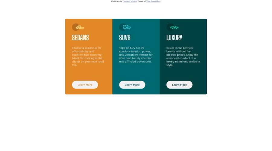
3-column-preview-card-component


Design comparison

Solution retrospective
-could someone give me feedback on my work
Community feedback
- P@danielmrz-devPosted over 1 year ago
Hello, @OsatohanmwenT!
Your project looks great!
I noticed that you used
position: absolute;to place your card in the middle of the page. Here are two ways to do it, in case you wanna try other options in the future (one of them isposition absolutebut a bit different than yours:- You can apply this to the body:
body {
    height: 100vh;
    display: flex;
    justify-content: center;
    align-items: center;
}
2 - or you can apply this to the element you wanna center (almost like you did):
.element {
            position: absolute;
            top: 50%;
            left: 50%;
            transform: translate(-50%, -50%);
}
I hope it helps!
Other than that, great job!
Marked as helpful0 - @kimodev1990Posted over 1 year ago
- It's better to use percentage values than definite values in sizes for width, height, font-size etc.... to make your design flexible.
- To help your responsive design even better, You could use clamp( ) method in your coding ,so your design will change according to the viewport dimensions and will be suitable for any device layout. Other than that, Nice work & keep Going on
Marked as helpful0@kimodev1990Posted over 1 year ago@OsatohanmwenT You're always welcome, Any time, bro
Marked as helpful0 - @GhraviteePosted over 1 year ago
Hello @OsatohanmwenT, congrats on completing this challenge. Here are some tips to make your code better.
To center your container, you can simply make use of flexbox on its direct parent which in your case will be the wrapper. Your code will look like so: .wrapper { display: flex; justify-content: center; align-items: center; min-height: 100vh; padding: 5rem 2rem; // Add padding on its direct parent to avoid your container from touching the top, bottom, and sides of the screen for mobile view. }
Avoid using definite values such as 250px for width or height. Instead, make use of percentages, this makes responsiveness possible.
I hope this helps. Happy coding
Marked as helpful0


Please log in to post a comment
Log in with GitHub
Join our Discord community
Join thousands of Frontend Mentor community members taking the challenges, sharing resources, helping each other, and chatting about all things front-end!
Join our Discord